We crafted an immersive, branded online booking experience that increased engagement and conversions
Client: Zenoti
Duration:1 year
We completely reimagined online booking for salons, spas, and medical spas, creating a solution that businesses can seamlessly integrate into their websites or deploy as fully-branded mobile applications. The revamp delivered dual impact: stunning, immersive branded experiences that reflect each business's unique identity, while simultaneously driving significant increases in booking conversions and revenue generation through optimized user journeys and intelligent upselling capabilities.
The challenge
Online booking represents the lion's share of revenue for most beauty and wellness businesses, making it their most critical digital touchpoint. Yet we faced a fundamental paradox: these businesses demonstrate extraordinary attention to detail within their physical spaces—from carefully curated ambiance to personalized service—but were constrained by rigid online booking experiences that failed to reflect their brand sophistication.
Each of our three verticals—salons, spas, and medical spas—operates with distinct service models and customer expectations. Within each vertical, individual businesses have vastly diverse needs for what they want to offer customers during the booking journey. The platform had to be flexible enough to accommodate this range of requirements while remaining intuitive for both business owners to configure and customers to navigate. The stakes were high: a poor online booking experience could undermine years of brand building and drive potential customers to competitors.
The discovery
We conducted comprehensive research using multiple methodologies to understand the full scope of improvement opportunities:
Data-Driven Journey Analysis: We mapped conversion funnels across different customer cohorts, benchmarking top performers against struggling accounts. This revealed what the top 10% of businesses were doing differently to achieve superior booking rates.
Behavioral Deep Dive: Session recordings uncovered the "why" behind conversion data, exposing numerous functional and interaction issues that were invisible in aggregate metrics—from confusing navigation patterns to abandoned booking flows.
Direct User Validation: We interviewed two dozen users and conducted live user testing sessions to validate our data findings. These sessions revealed specific friction points and confirmed where users experienced confusion or frustration during their booking journey.
Competitive Intelligence: We analyzed competitor offerings and gathered feedback from our customer-facing teams about common complaints and feature requests, particularly from businesses migrating from other platforms where they had experienced superior functionality.
The Ten Commandments
Our research findings crystallized into 10 core principles—the "10 Commandments for Seamless Booking"—that guided every design and development decision throughout the project.
#1: Mobile-first, always
Data revealed that over 75% of booking visitors came from mobile devices, making mobile optimization not just important but critical. This insight drove our mobile-first design philosophy from day one.
We leveraged proven app interaction patterns and layout paradigms to create an intuitive mobile web experience that felt native to users' expectations.
For desktop experiences, we avoided the common mistake of simply plopping the mobile view onto larger screens. Instead, we leveraged the additional real estate thoughtfully—adding contextual information, multi-column layouts, and enhanced visual elements—while maintaining a unified codebase through responsive and adaptive design practices.
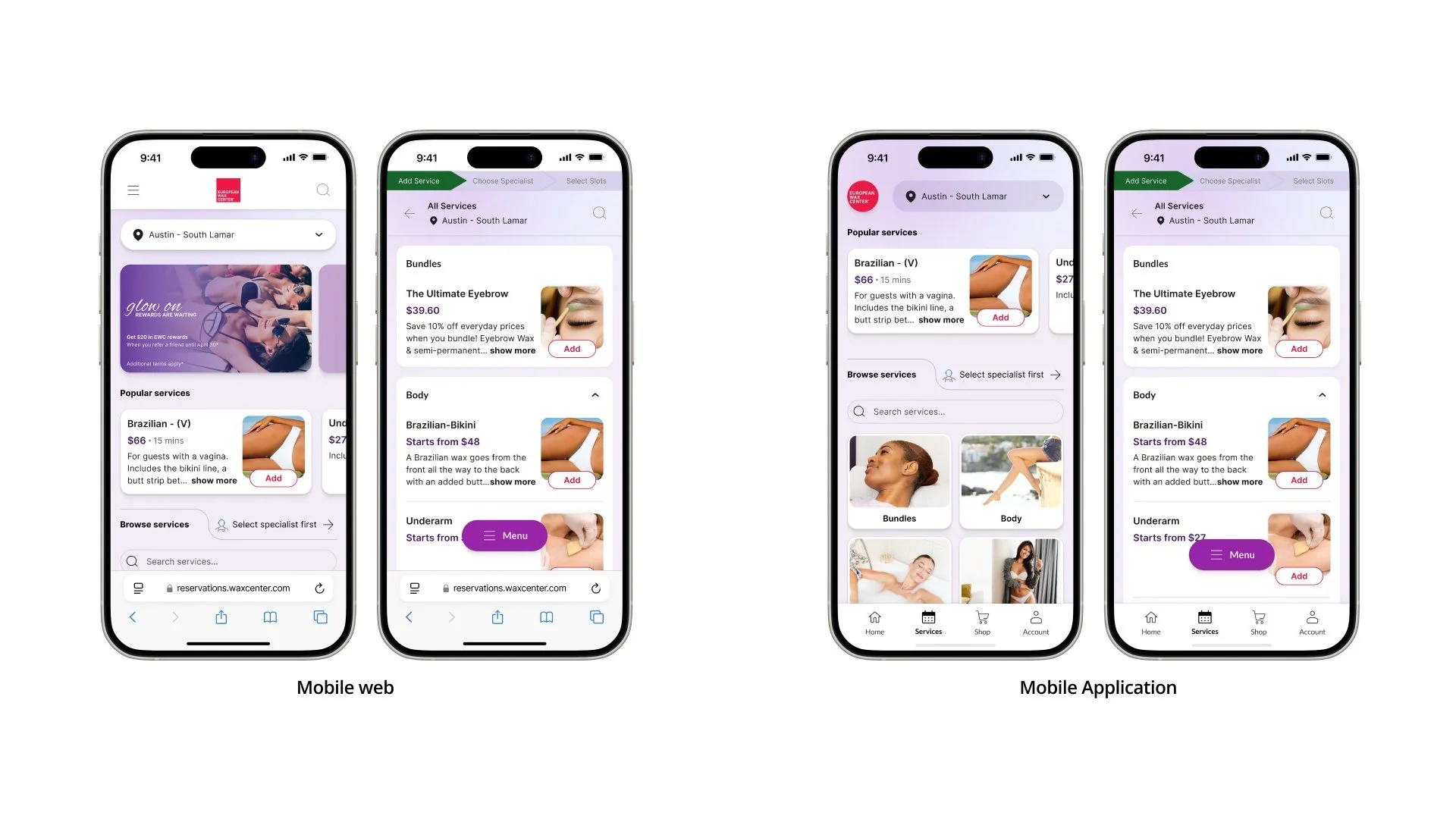
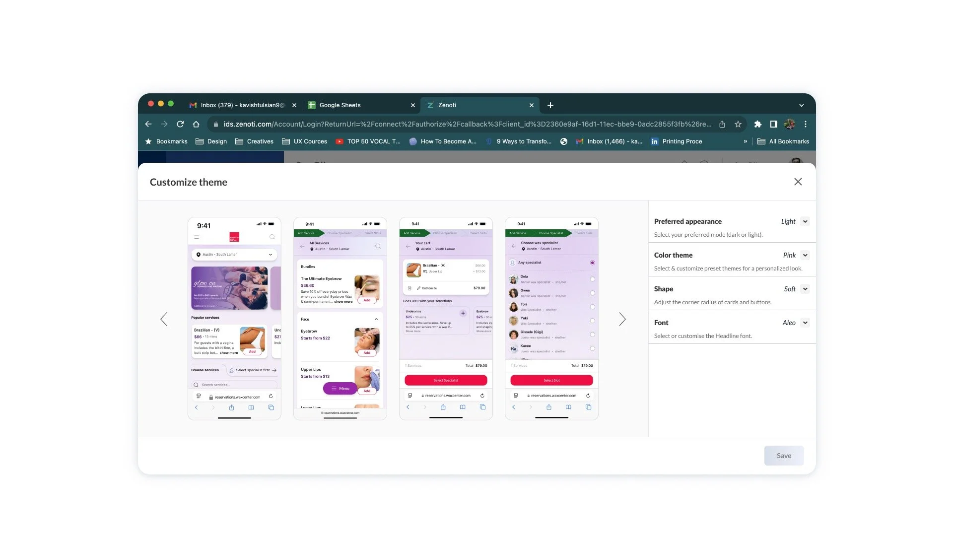
#2: Plug-n-play flexibility
We abandoned the one-size-fits-all approach that plagued the legacy platform. Every business is unique, and our platform needed to respect and amplify that individuality.
Our solution centered on modular widgets for the landing page and home screen—each fully customizable to match the business's brand identity, voice, and specific offerings. Business owners can enable, disable, and sequence these widgets in any combination, creating truly personalized booking experiences.
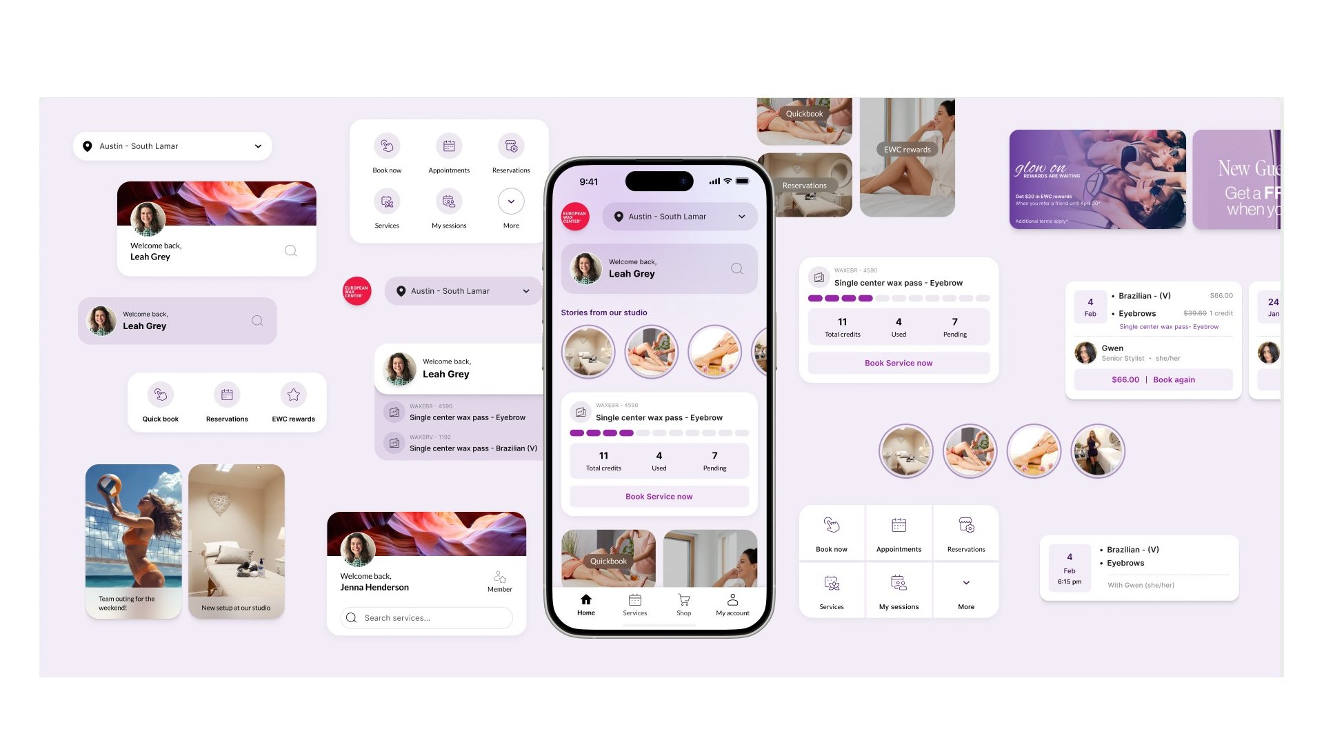
The result: no two businesses look alike. A high-end medical spa can showcase detailed treatment information and before/after galleries, while a neighborhood salon can emphasize quick booking and loyalty rewards. This flexibility ensures each business's unique value proposition shines through their booking experience.
#3: Brand, front and center
Our goal was to deliver a branded experience that felt as bespoke as a custom application.
The solution was not to offer superficial skinning options, but to build a flexible design language driven by robust design tokens. These tokens enabled businesses to customize core visual elements—colors, textures, button styles, and a comprehensive typographic scale—to closely align with their brand identity.
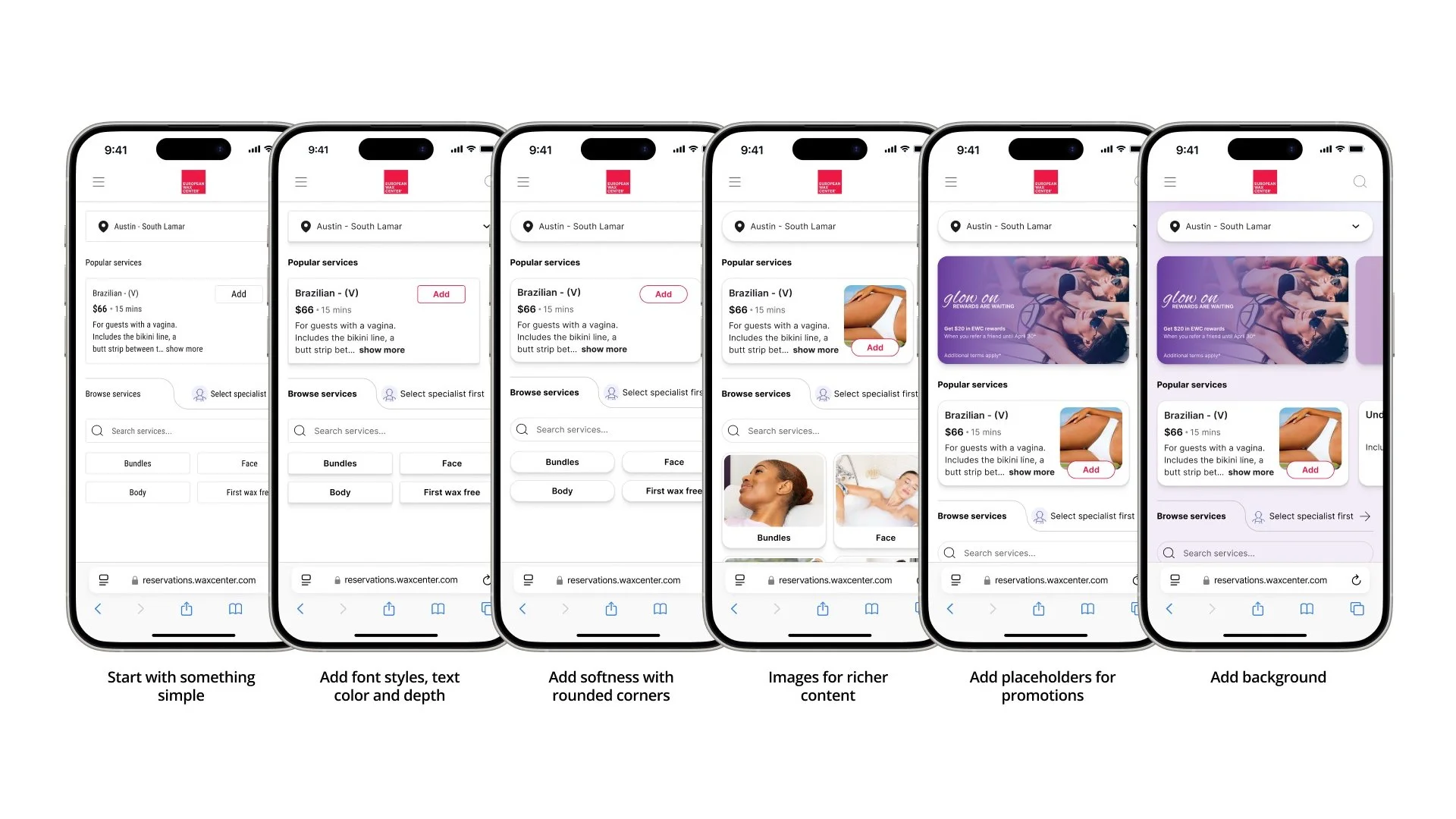
This token-based architecture enabled our platform to absorb and reflect a partner’s brand with incredible fidelity, ensuring the entire booking journey felt cohesive, trustworthy, and seamlessly integrated with their main website.
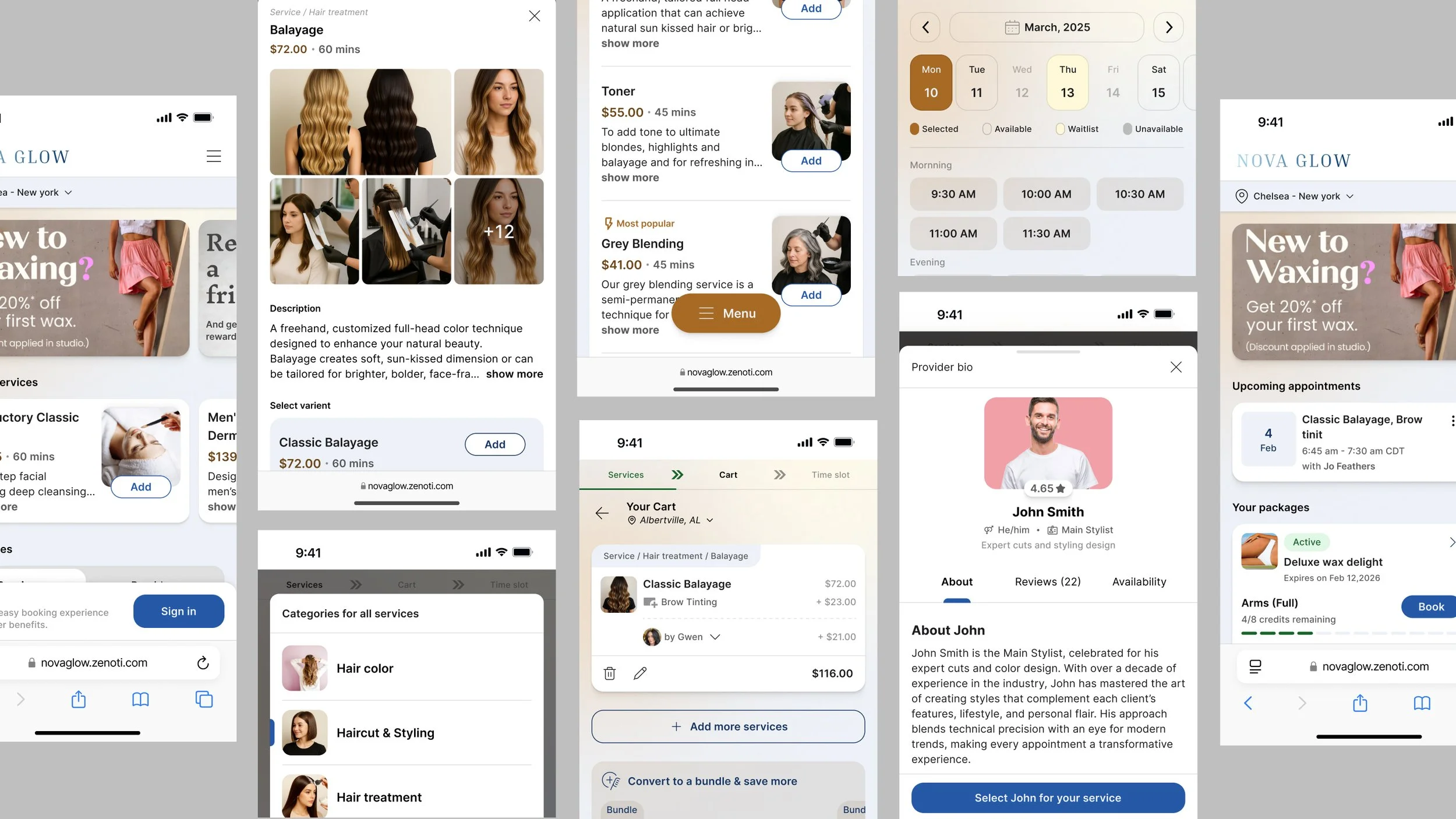
#4: Effortless browsing
A beautiful interface means little if users get lost. This principle was centered on making the discovery of services intuitive. Recognizing the diversity of our partners, we created multiple catalog templates to elegantly display everything from a barbershop's five core services to a luxury spa's hundred-item menu.
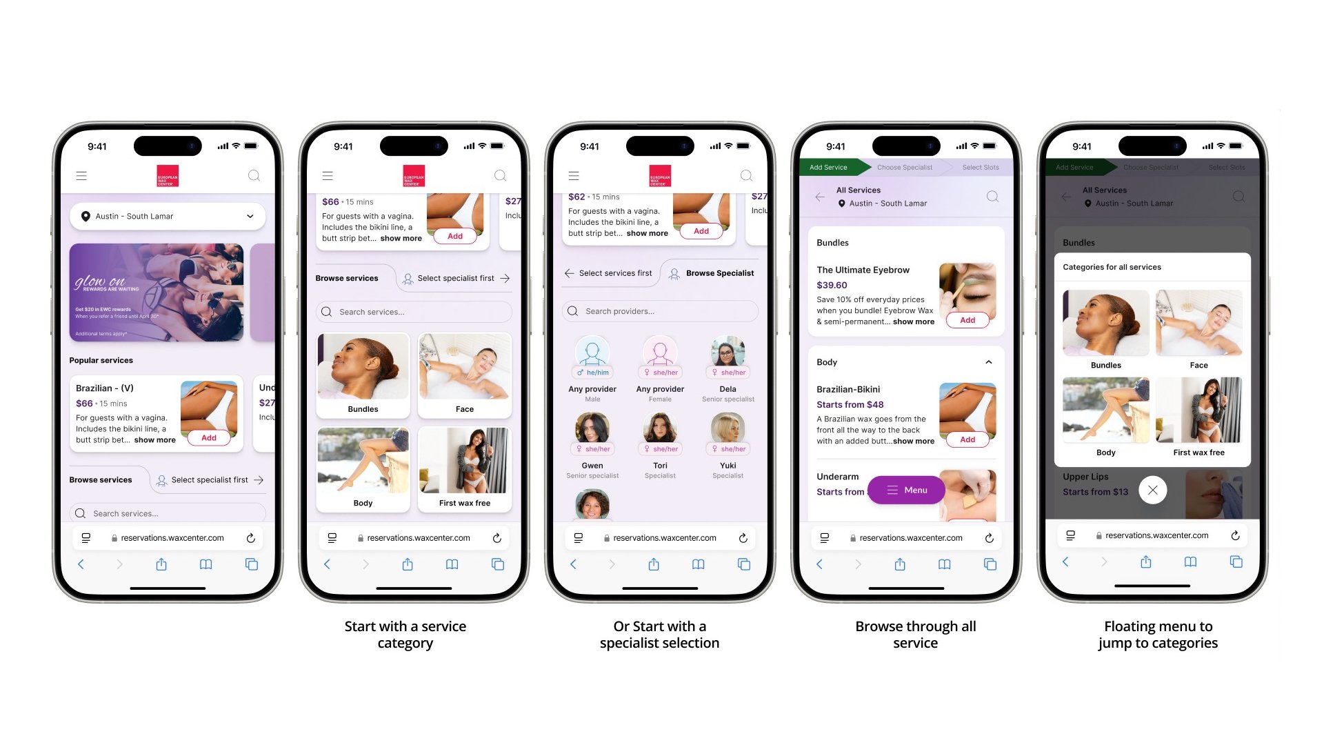
We also catered to different user intents by allowing them to start by exploring services or by selecting a preferred provider first.
For new visitors, we implemented an intelligent 'wizard' that asked simple questions to recommend the perfect service and provider, actively reducing decision fatigue and accelerating the path to booking.
#5: Engage through rich content
Our user testing uncovered a critical conversion blocker: uncertainty. Customers hesitated because they didn't fully understand the service they were about to purchase. To combat this, we re-architected service pages to support rich content—videos, photos, and what-to-expect guides—so businesses could answer every question before it became a barrier to booking.
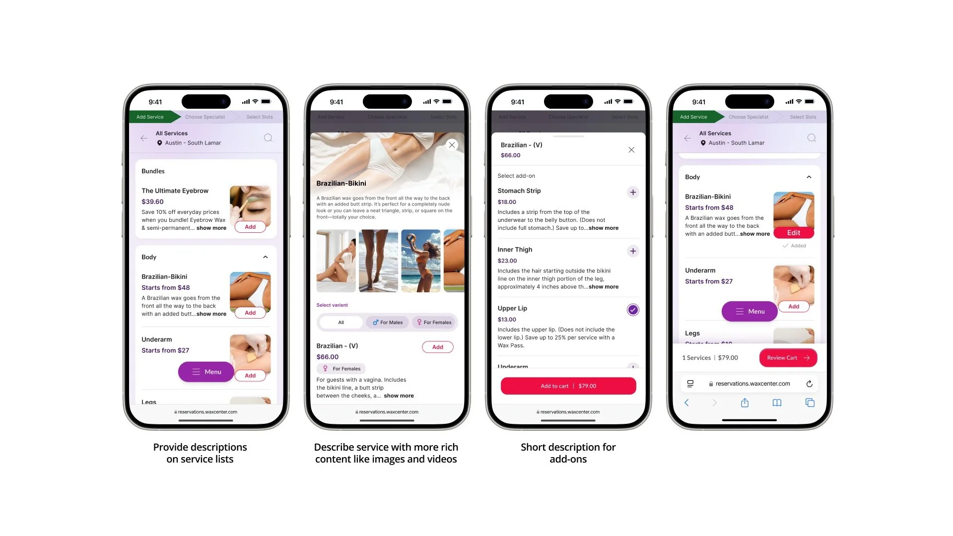
This principle also extended to provider selection. Instead of new customers defaulting to the "first available," we created extensive provider profiles with image galleries and verified patron reviews, transforming staff from names on a schedule into trusted experts and helping customers choose with confidence.
#6: Smart upselling
We saw a massive opportunity to help our partners grow their revenue per customer. The old platform's basic add-on feature was a blunt instrument. We replaced it with intelligent, contextual upselling. By reviewing the journey, we placed thoughtful suggestions at the right time—presenting a cost-saving package after a single service was selected, or offering a membership on a second visit.
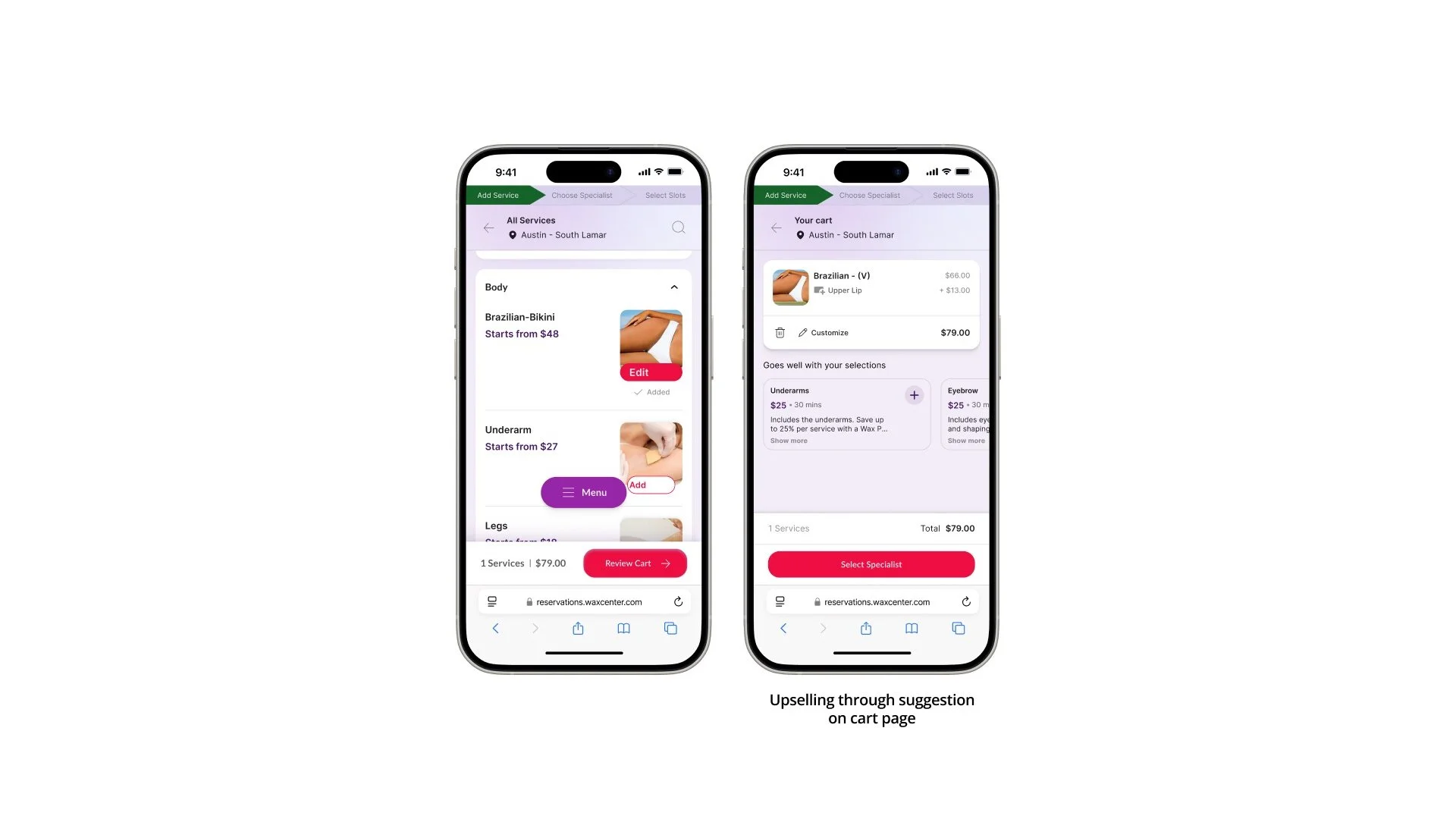
These offers were framed with friendly, benefit-driven language, creating a win-win: the customer gets a better deal, and the business secures higher revenue and loyalty.
#7: Step-by-step simplicity
Our user testing revealed a significant source of friction: the single-page booking funnel. This design forced users, especially on mobile, to constantly scroll up and down to review or modify selections, creating a disorienting and error-prone experience. To fix this, we replaced the overwhelming single page with a clean, progressive workflow, logically chunking the journey into distinct stages: selecting services, choosing a provider, and picking a date/time.
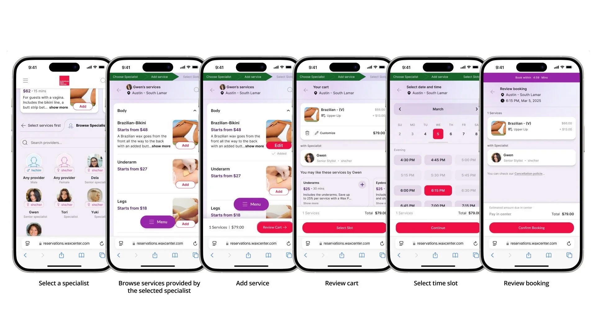
Each step focused the user on a single task, dramatically reducing cognitive load. A clear progress indicator ensured they always knew where they were in the process, replacing confusion with a sense of calm control and forward momentum.
#8: Frictionless checkout
The checkout is the final hurdle where even the smallest friction can lead to an abandoned booking. We identified the mandatory 'Login or Sign Up' wall as the single greatest point of failure in the old funnel. Our eighth principle, 'Frictionless Checkout,' was dedicated to making this final step the easiest one of all. Instead of forcing account creation, we implemented a simple, code-based verification system.
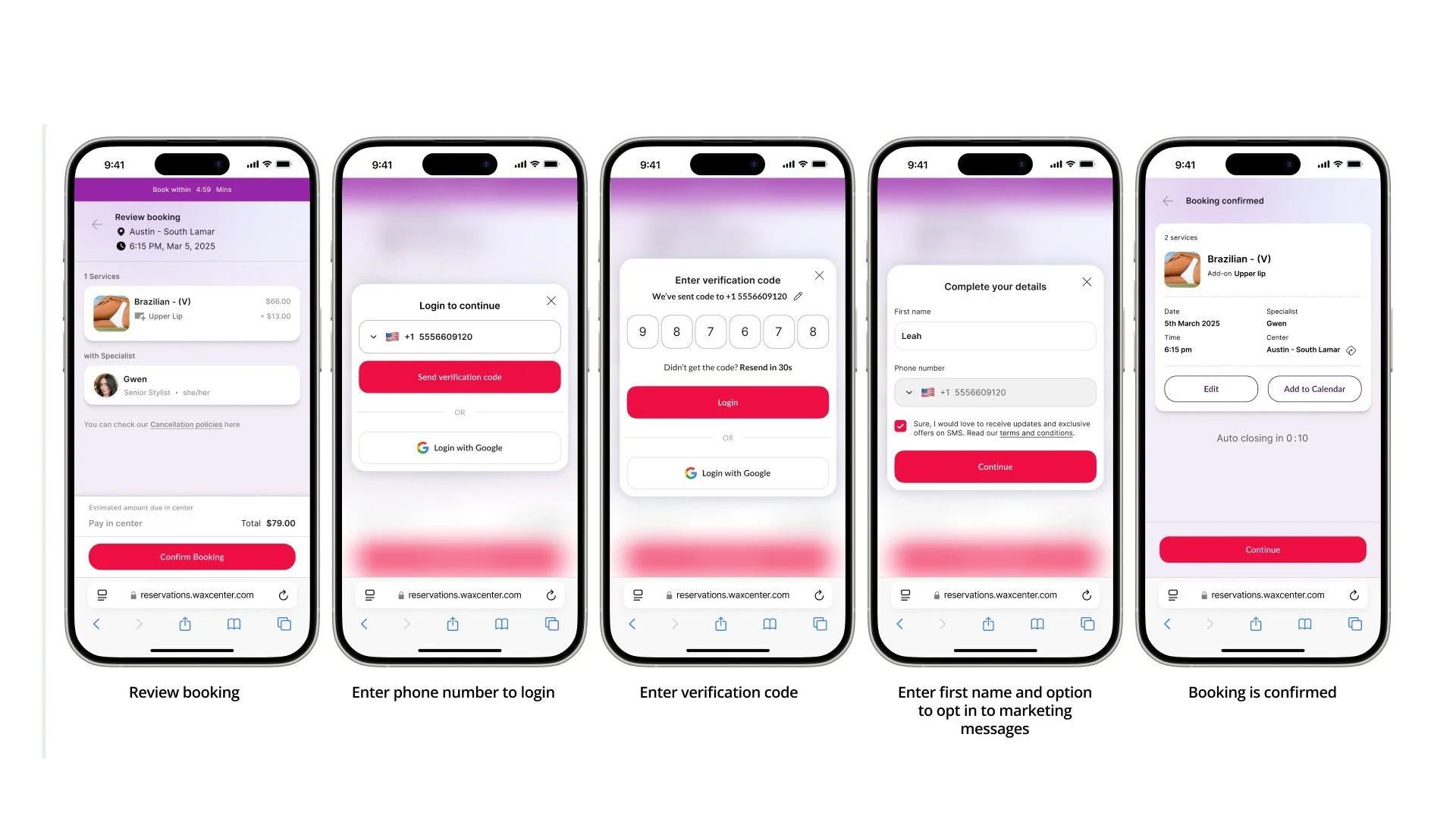
We also holistically improved the entire flow, streamlining the review and approval of terms and integrating modern payment solutions to make the final transaction swift, reliable, and trustworthy.
#9: Win back lost guests
We accepted a critical reality: no matter how intuitive the experience, some users will abandon their booking for reasons beyond our control, like a lack of immediate availability. Our ninth principle, 'Win Back Lost Guests,' was designed as a proactive safety net to recover these high-intent users.
When a preferred time slot was unavailable, we turned a dead end into an opportunity. Our simplified Waitlist feature allowed users to be notified of cancellations with a single tap, offering granular or high-level choices for their availability.
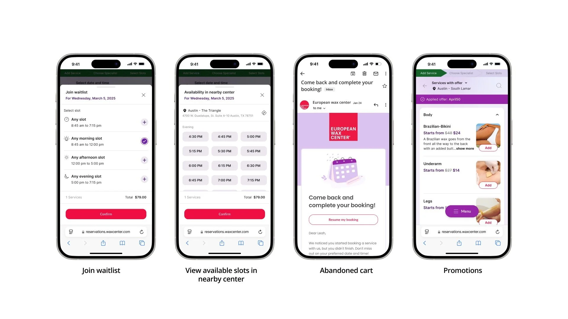
Simultaneously, the system would intelligently check for and suggest openings at other nearby locations for the same time, often saving the booking in real-time.
Finally, for any user who dropped off, a friendly email allowed them to resume their booking exactly where they left off with one click, overcoming distraction and hesitation.
#10: Make it yours, make it fast
The success of all our preceding principles rested on one final challenge: could our business partners harness this newfound power easily? Our tenth commandment, 'Make It Yours, Make It Fast,' focused on this client empowerment.
Taking inspiration from the world's best website builders, we designed an engaging onboarding experience and an array of intuitive tools. This guided process felt less like configuring settings and more like creatively building. It allowed business owners to discover the possibilities—personalizing their brand colors, arranging widgets, and structuring their service catalog—all through a simple interface.
This didn't just accelerate setup; it ensured our partners could quickly and confidently launch a booking experience that was a true, cohesive extension of their brand, both visually and functionally.
The impact: Validating our vision with beta partners
The true test of our ten principles was a beta launch with a select group of 15 partners, ranging from small boutiques to large multi-location enterprises. The early data and qualitative feedback have been overwhelmingly positive, validating our core thesis that a superior brand experience directly drives business growth. The key performance indicators from the beta period revealed significant improvements across the entire customer journey:
Faster Go-Live: A whopping 1/3rd reduction in the average time required for a business to set up and launch their booking experience, thanks to the "Make It Yours, Make It Fast" onboarding.
Increased Conversion Rates: A 24% average increase in the conversion rate from 'service viewed' to 'booking completed,' directly addressing the friction points we identified in our discovery phase.
Higher Booking Value: A 12% lift in the average value of each booking, driven by the success of our 'Smart Upselling' prompts for packages and memberships.
Deeper New User Engagement: New visitors spent 45% more time interacting with the rich content on service and provider pages, leading to more informed and confident booking decisions.
Effortless Rebooking: Returning users were able to complete their bookings almost twice as fast, a direct result of the 'Step-by-Step Simplicity' and 'Frictionless Checkout' principles.
Conclusion: More than metrics, a partnership in pride
While the quantitative results were compelling, the most profound impact was the shift in our partners' perception of their own online presence.
Previously, the booking tool was a disconnected utility. Today, our partners express a genuine sense of love and pride in showcasing it. For the first time, their booking platform is a beautiful, seamless extension of their brand—one they are excited for their customers to experience. This was reflected in overwhelmingly positive social reviews, not just for their services, but for the ease and elegance of the booking process itself.