We revamped enterprise legacy software to boost NPS and reduce churn
Client: Zenoti
Duration: 2 years
I spearheaded a vast multi-year design transformative project to revitalize the front desk modules of our product line. We ended up transforming clunky, cumbersome products into sleek, user-friendly solutions that garnered immense appreciation and reduced churn.
The challenge
First off, the business was growing 50% year-over-year and our teams were constantly adding new features on top of these products to support the needs of large enterprise customers getting onboarded. While there was a lot of focus on meeting ‘functional parity’ for such customers, there was an ever-growing sense of frustration around the perceived lack of usability, performance, and quality of these products. In fact, product usability was seen as one of the three primary reasons (along with support and performance) for customer churn.
The discovery
Various customer-facing teams: support, implementation, customer success, and sales had been capturing and sharing a ton of feedback from irate customers and prospects to the product team over the last few years. We began by meeting key representatives to understand their perspectives and started to collate all feedback into one place.
Next, we split the team into multiple groups of 2-3 bringing in folks with diverse experience (junior/senior/lead), competency (research/Interaction/visual), and location (onsite/remote). This deliberate arrangement was the cornerstone of our strategy and cultivated a culture of empowerment and ownership, as each group assumed responsibility for its designated domain.
After teams were allocated their respective areas, we started to work on formalizing a standard playbook on how we will conduct discovery to understand the problem areas deeply. This involved a combination of both qualitative and quantitative tactics that helped us get sufficient context of what we were solving for.
Reviewing and categorising feedback from customer-facing teams
Interviewing customers to validate this feedback and empathize with their pain points
Analyzing thousands of support tickets and finding patterns
Viewing product usage on actual premises
Studying Quick Sight data to understand the most frequent workflows to optimise
Analyzing direct competitors that we were losing customers to (or being compared with)
Researching indirect competitors for benchmarking best practices
Conducting deep usability audit to unearth hidden issues
The principles
To ensure sufficient clarity amidst the complexity of this daunting undertaking, we committed to a set of design principles to serve as the North Star guiding our project through its evolution and foster synergy with a large team of PMs and engineers.
Make all apps across different platforms and devices feel familiar in the form of one, cohesive Zenoti
Build experiences that feel ‘natural’ to every platform by making them seamlessly adapt to the device user is on
Keep UI clean and uncluttered so users feel calm and confident
Optimize high-frequency tasks for minimal time and clicks, outperforming all competitors
Make our products accessible to users with a range of abilities and perspectives
Focus on incremental updates over big-bang overhauls such that they can be deployed to all users with minimal disruption
Below, I share some highlights of the work done during this period
Guest kiosk
Appointment book
Guest profile
Point of sale
Booking Wizard
And many more…
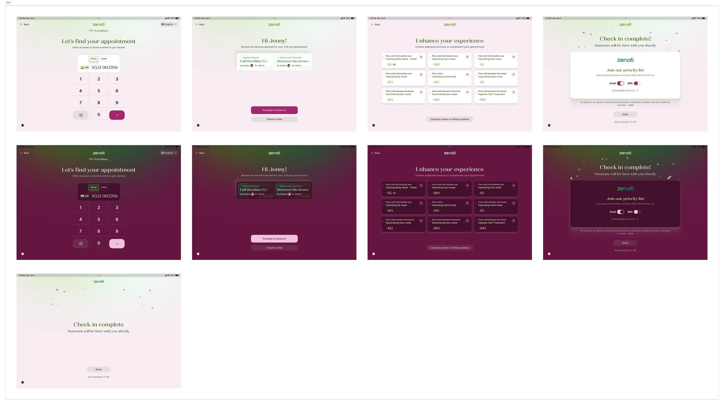
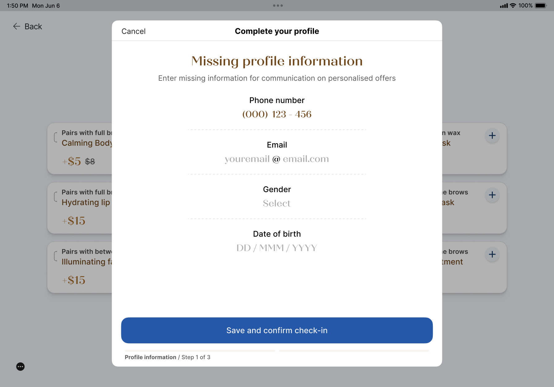
Guest kiosk: How we rebuilt the self-serve experience into a stunning brand app that brings the in-store experience to life
The kiosk App was intended to be a solution to streamline operations in salons and spas by enabling guests to check in to their appointments or add themselves to the queue, allowing staff to focus on service rather than administrative tasks. However, despite its potential, the app struggled with adoption. Beyond its outdated design and clunky experience, the app also completely lacked brand cohesiveness, sticking out like a sore thumb in these otherwise beautifully curated spaces. The result? Low guest engagement and an experience that felt inconsistent with the high standards these brands aim to provide.
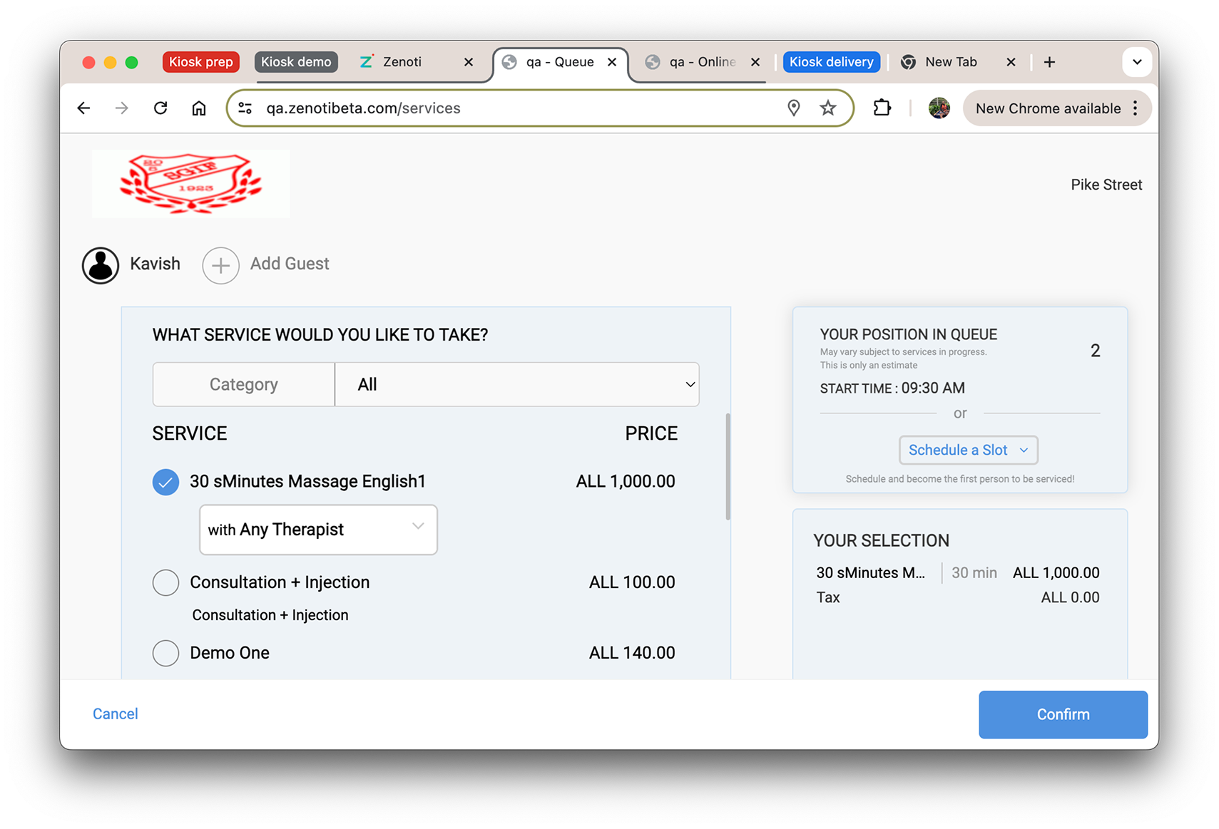
The goals for the Kiosk App revamp were clear: to create an intuitive, brand-aligned experience that enhances both functionality and aesthetics. That translated into reducing friction for guests, maximizing engagement, and ensuring the app seamlessly integrates with the sophisticated look and feel of the salons and spas it serves
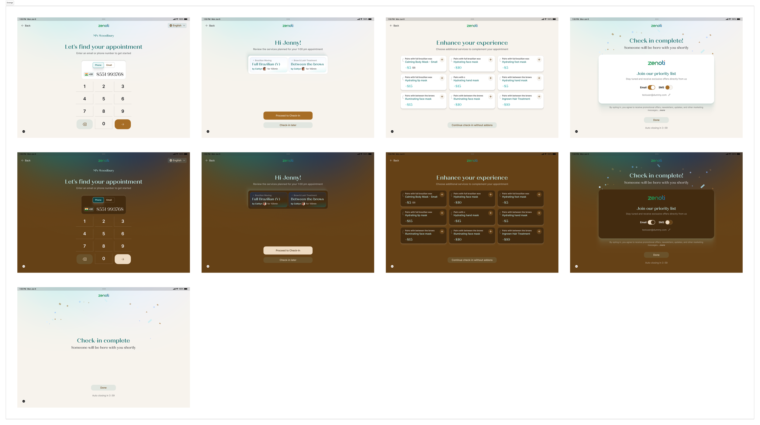
To solve the brand integration challenge, we built a flexible design system that allows the Kiosk App to effortlessly align with the aesthetic of each salon or spa. This system employs carefully crafted themes that offer customization across a range of design elements, including a flexible color palette, typography, shapes, and depth. With this setup, salons can adjust colors to match their interior decor, choose typography that resonates with their branding, and customize shapes and shadows to create a sense of depth that feels modern yet warm. This adaptable design system provides a cohesive, on-brand experience for each location, making the kiosk look like a natural extension of the salon environment rather than a generic check-in station.
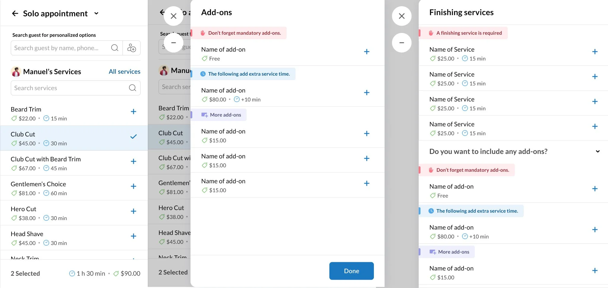
At the heart of the Kiosk App revamp is a reimagined booking experience tailored specifically for walk-in guests. Recognizing that a one-size-fits-all approach didn't do justice to the unique offerings of each brand, we developed a series of flexible templates that allow salons and spas to curate a catalog experience that feels genuinely their own. These templates let brands organize services, highlight popular options, and guide guests through a personalized selection process that aligns with the brand’s style and tone.
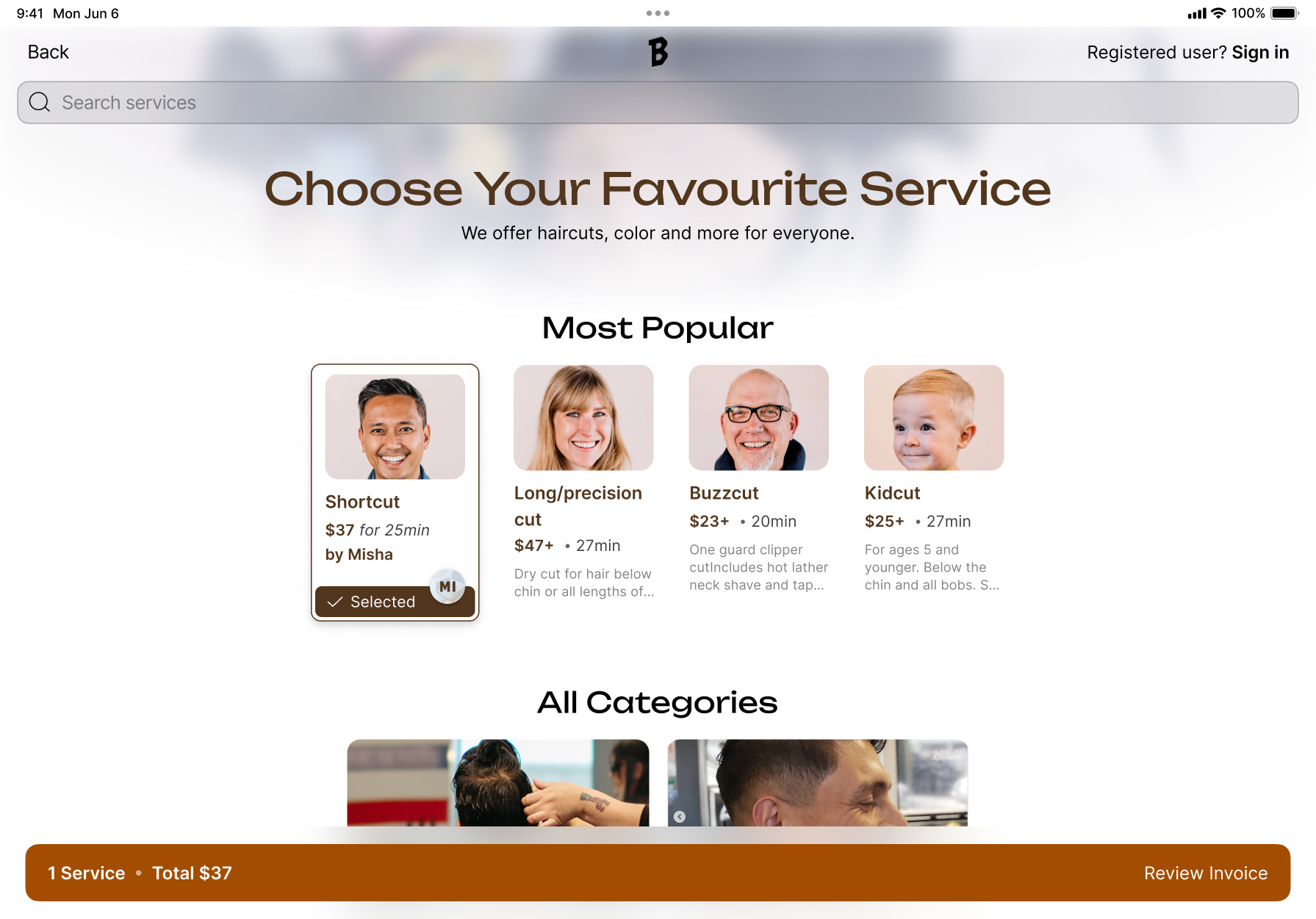
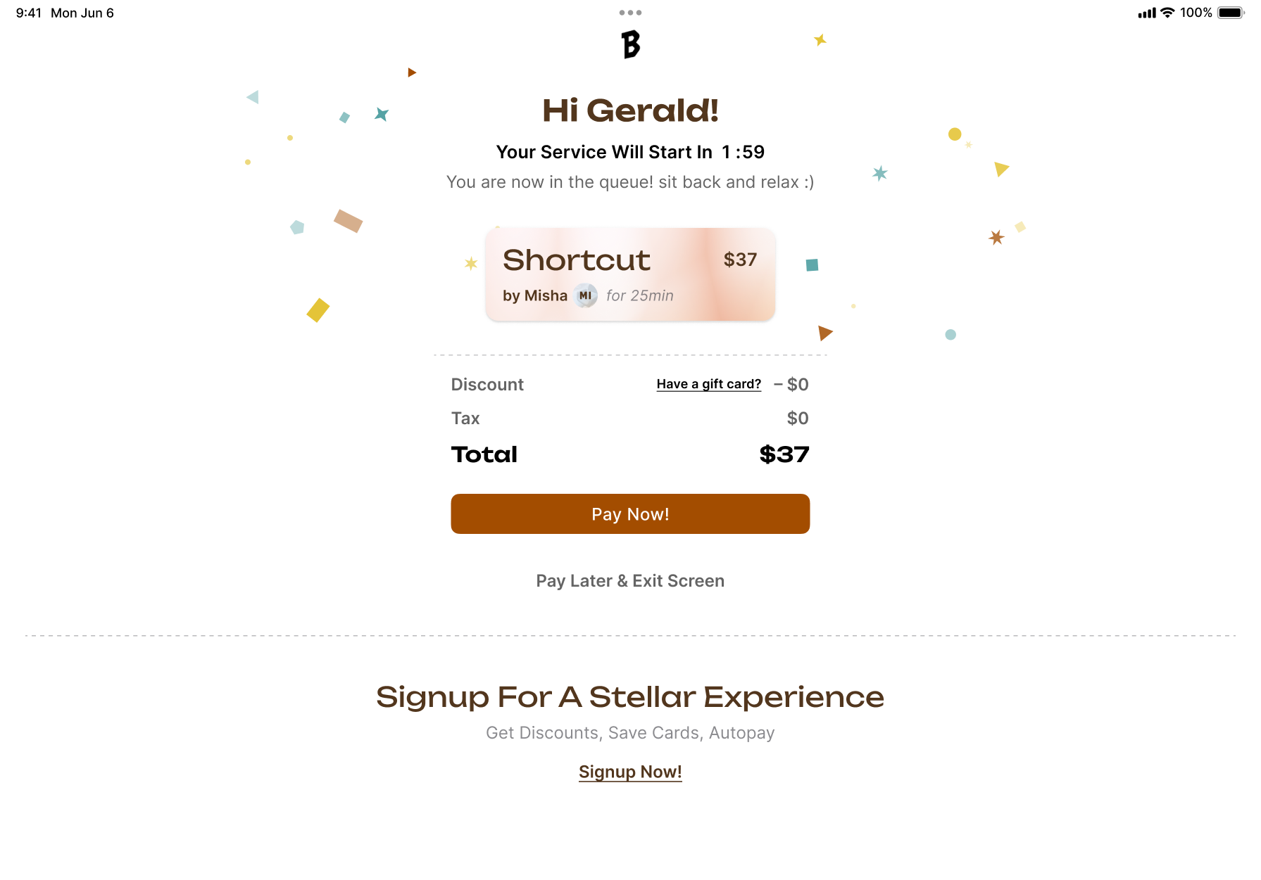
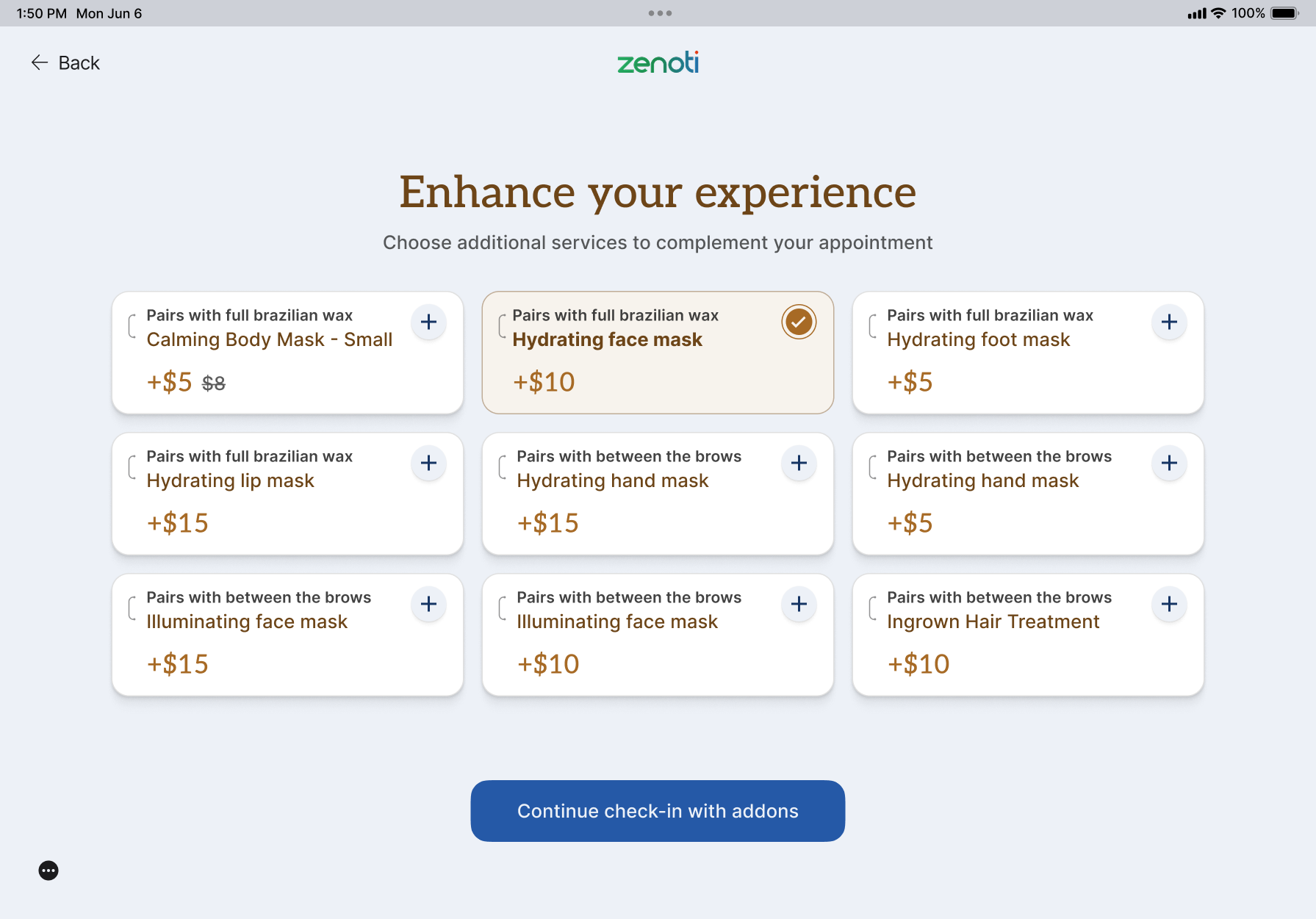
Beyond design, we enhanced the Kiosk App’s functionality to boost client engagement and elevate each brand’s profile. New features were developed with a focus on both convenience and marketing potential. For instance, the app now offers carefully selected service add-ons that can be booked based on real-time availability from the stylist’s and store’s schedule. This helps guests make the most of their visit while optimizing store resources.
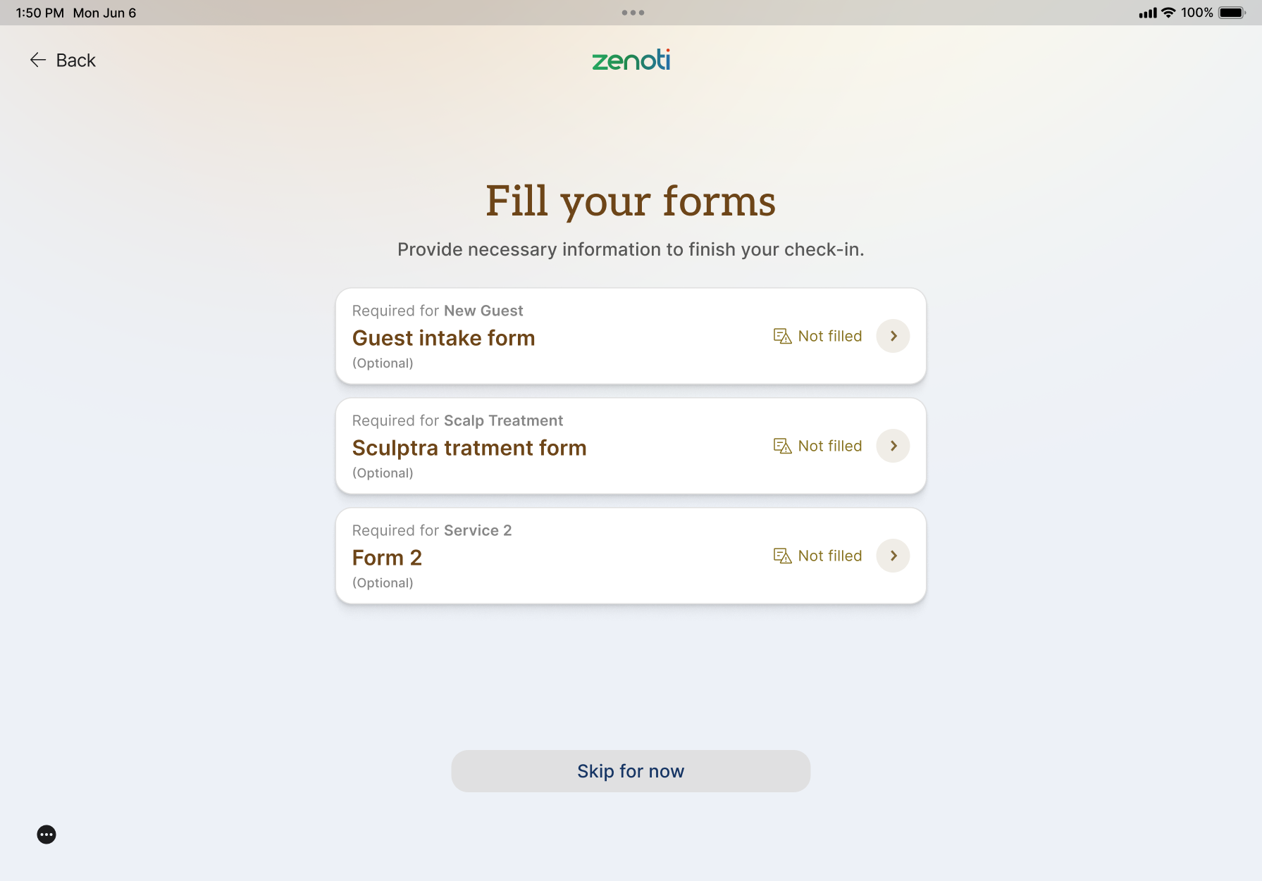
Additionally, we included prompts for guests to complete any blank or partially filled consent forms, ensuring that important information is always up-to-date.
To further drive engagement, the app now encourages users to opt into promotions, memberships, or loyalty programs, seamlessly integrating these options into the check-in process. These new features not only enhance the guest experience but also support brand loyalty and maximize opportunities for client connection—all while keeping the process smooth and inviting.
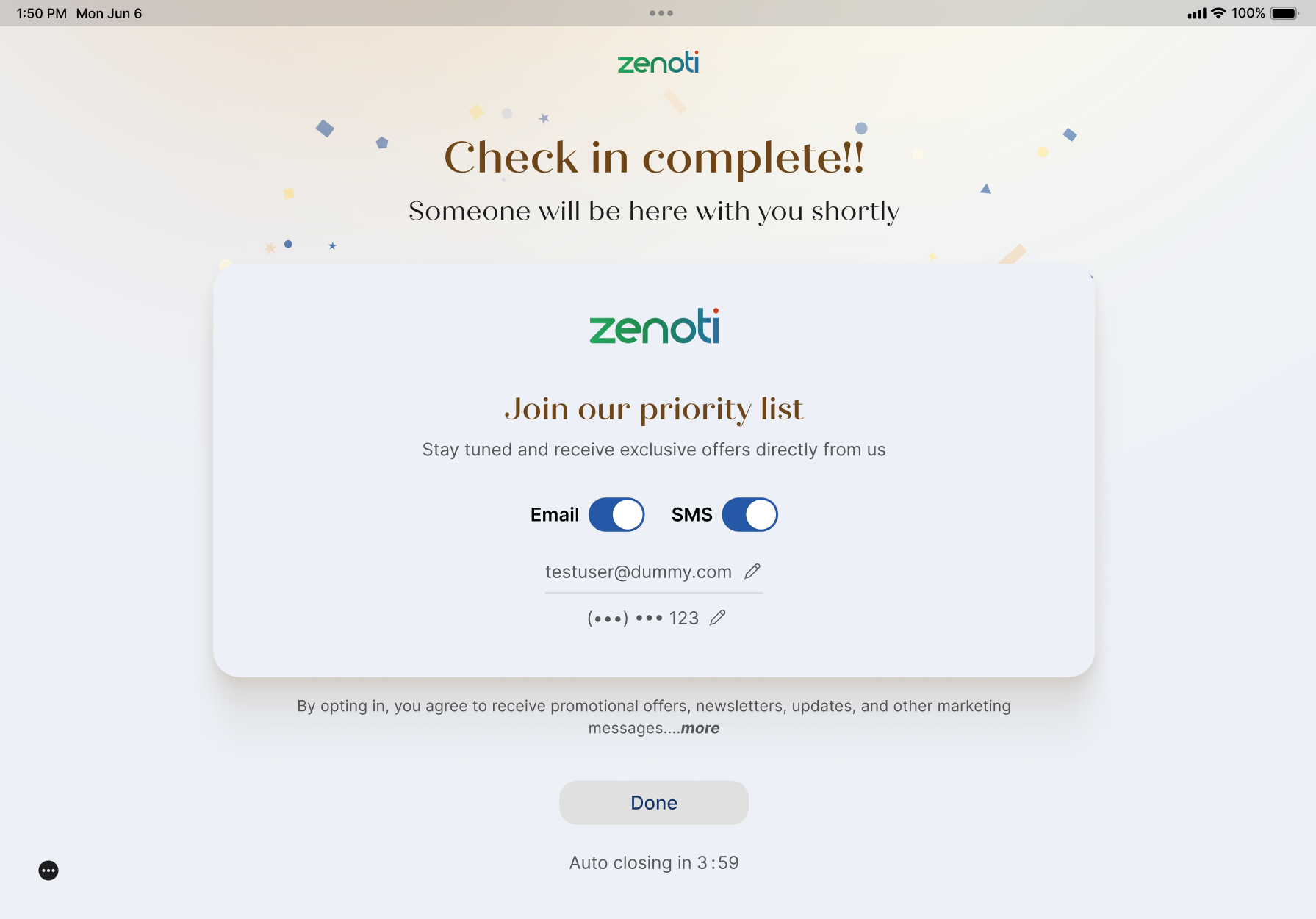
The results of the Kiosk App revamp have been transformative. With so many customers making the switch to the updated kiosk, salons and spas have seen a significant boost in efficiency and revenue. The flexible, branded design and enhanced booking experience have driven a 23% increase in bookings handled through the kiosk, saving hundreds of hours in front-desk labor and allowing staff to focus on service quality. Additionally, the streamlined process for service add-ons has directly contributed to more revenue, while the personalized prompts for promotions and memberships have led to a 10% increase in opt-ins to marketing offers. The most rewarding feedback, however, came directly from salon and spa managers, who shared how proud they felt to introduce such a beautifully designed, cohesive kiosk experience in their stores.
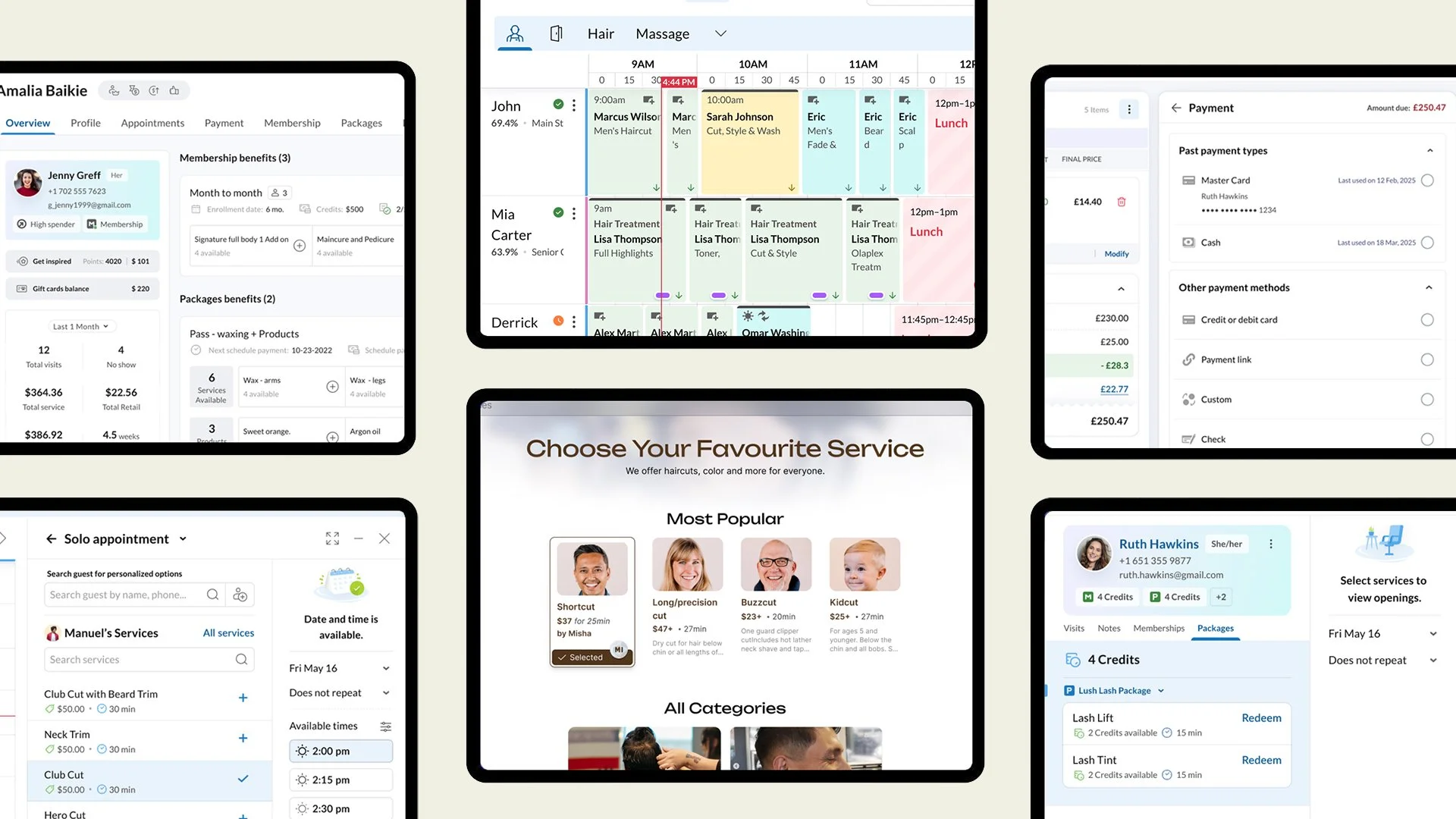
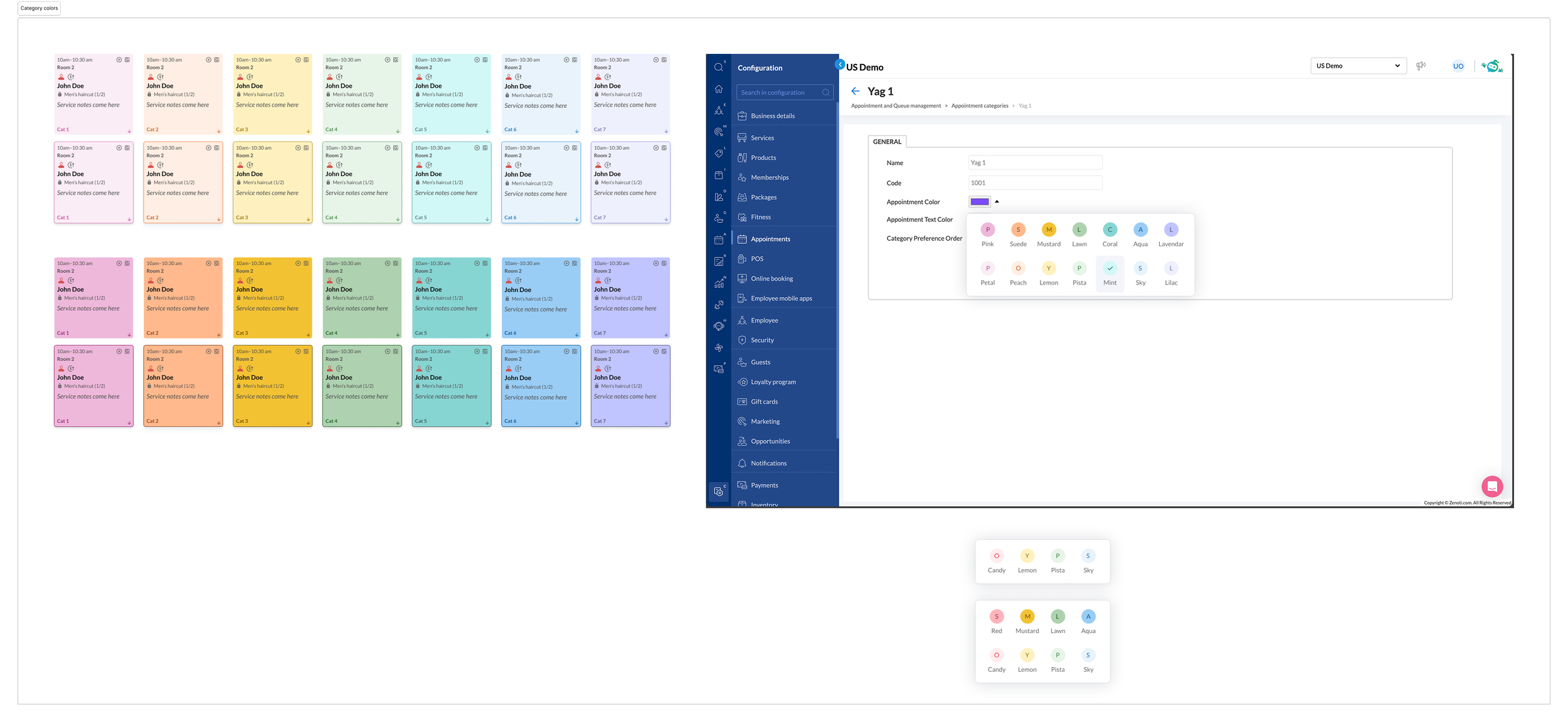
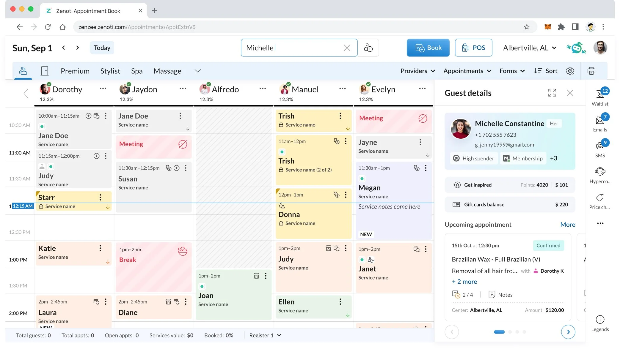
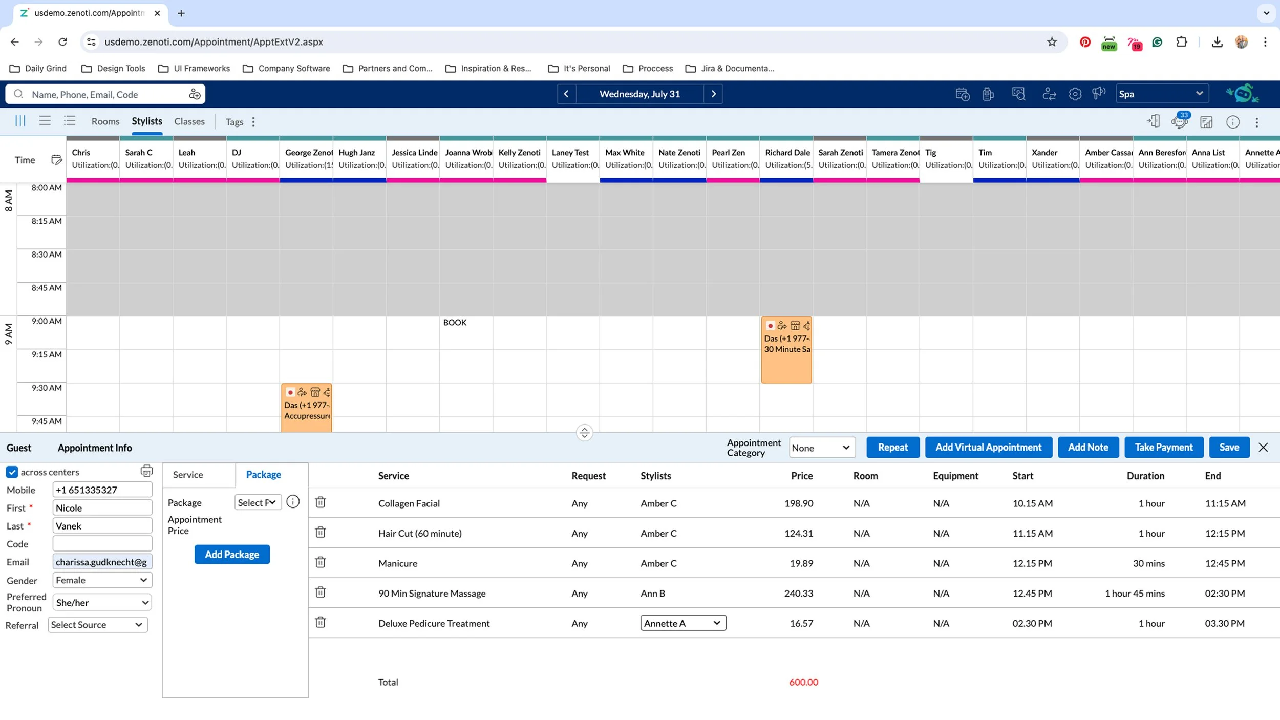
Appointment book: How we transformed the classic appointment book into a slick, modern tool that feels familiar yet new!

In revamping the appointment book, which serves as the front desk’s central hub, we took an extremely customer-centric approach. Knowing it’s the core tool staff rely on daily, we prioritized addressing all the recurring pain points customers had raised over the years in their feedback to product, support, and services teams. Additionally, we noted how customers in the midst of migrating from competing software often pointed out missing functions or tasks that felt more intuitive in their previous tools. We reached out to these customers, gained access to some of these competing tools, and conducted a detailed comparison of key workflows. This allowed us to validate firsthand which elements users appreciated elsewhere and where we could improve.
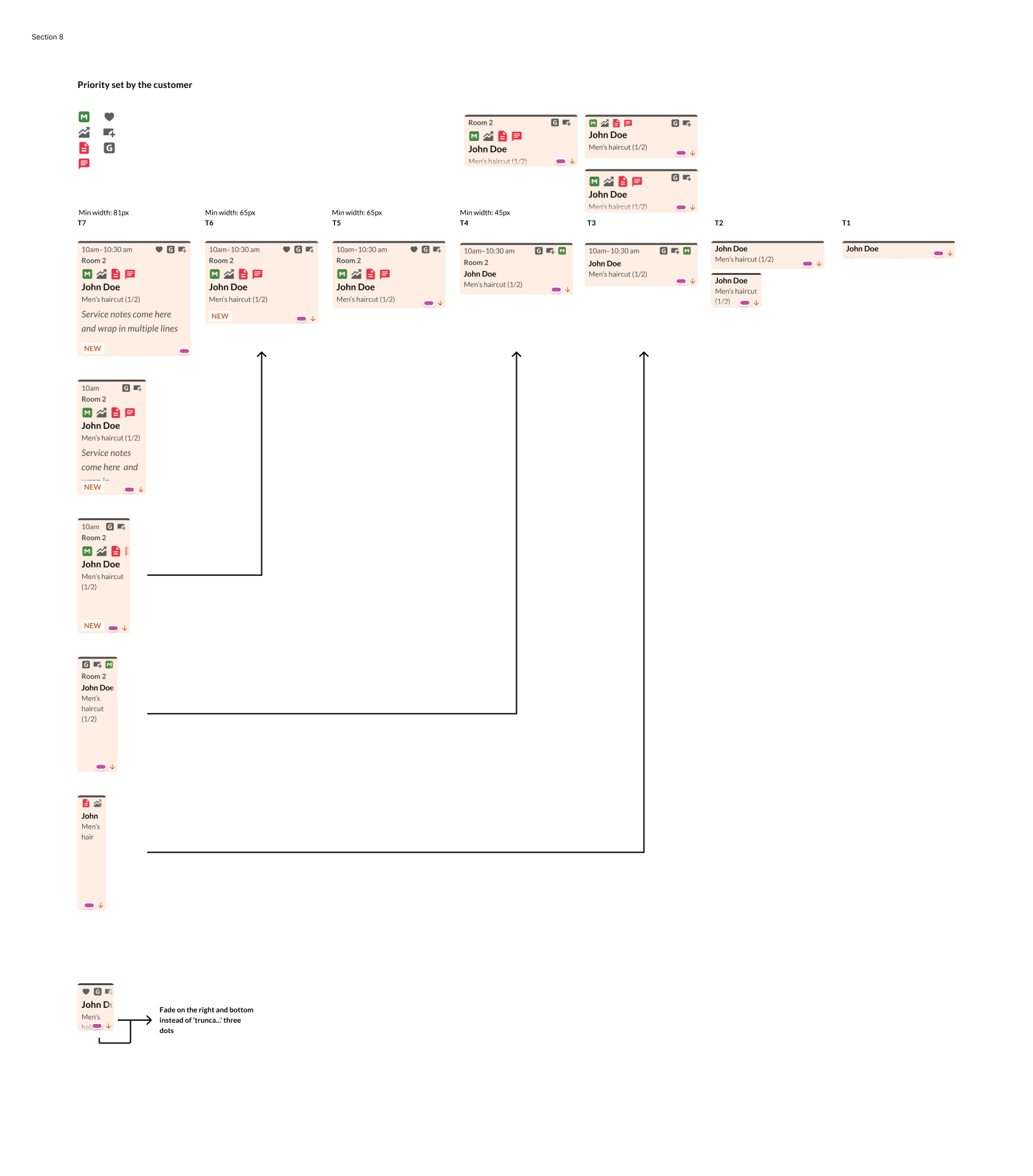
To tackle the revamp effectively, we split the work into two main areas. One designer focused on reimagining the appointment blocks, refining the information hierarchy based on the block sizes, and enhancing how users interact with them. We began by collecting all the data that front desk staff need to quickly review each appointment. Then, we categorized this information into key themes, allowing us to structure a more streamlined layout. From there, we assigned an order of precedence to each data category, ensuring that critical details are always visible, even as users adjust the zoom level. This layered approach allows us to dynamically prioritize information based on context.
Meanwhile, the other designer took a deep dive into the broader interface, reviewing the behaviors and functions related to date selection, search, filters, and navigation. Our top priority was decluttering an overwhelming layout filled with scattered icons that often obscured critical functions like filters and view options. To tackle this, we introduced a right rail in the UI to house all additional apps unrelated to the calendar. Each app now has a clear icon and label, making it easier to locate and understand. By moving these elements to the right rail, we freed up the calendar header to prominently display filters, allowing users to personalize their views with instant access. Users can now save these custom views for quick access, creating a more organized, intuitive experience that empowers staff to tailor the interface to their needs.
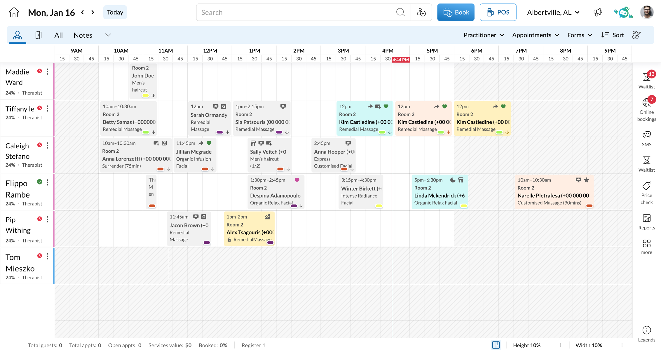
Beyond functional improvements, a major focus was giving the appointment book a fresh, modern look. We introduced a new color palette with balanced, pastel tones for a cleaner, more approachable aesthetic. Our design system was overhauled from the ground up—we redefined the type scale, fine-tuned spacing and margins, and built all-new components that work together seamlessly.
The result is a completely refreshed avatar that feels contemporary and polished while retaining a sense of familiarity, making the transition effortless for users and reinforcing the brand’s evolution. Within just two weeks of previewing, we were blown away by the response—an incredible 300 beta signups, smashing our goal and flooding us with enthusiastic feedback
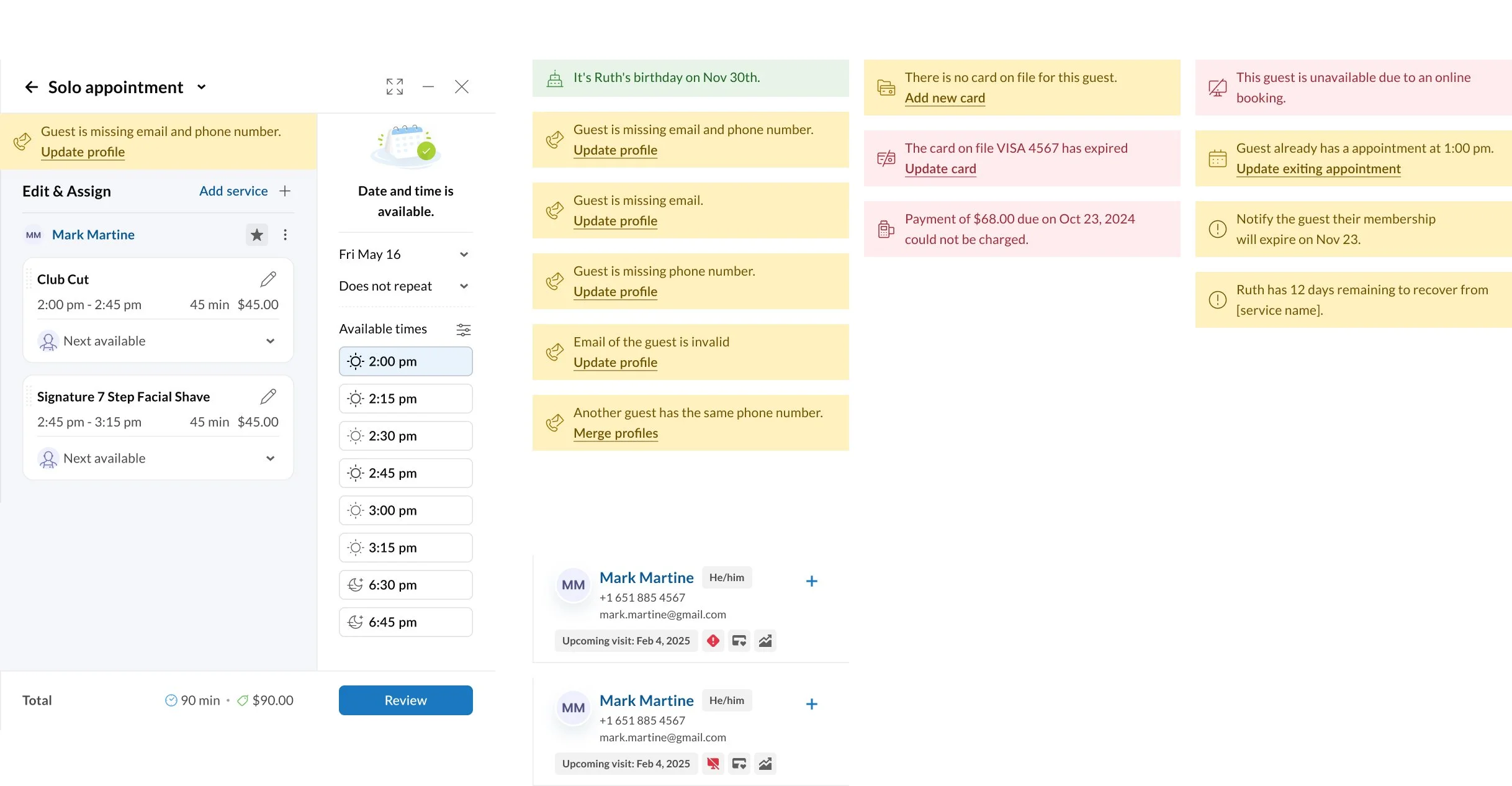
Guest Profile: How we transformed a clunky maze of tabs into a streamlined, guest profile experience
The guest profile module is the most visited section across our platform's touchpoints, yet for years, it has been left untouched. What started as a simple profile view had morphed into a chaotic maze of tabs, with every team adding more layers of information over time.
It became unmanageable. Businesses struggled to find essential details or make critical updates to guest profiles, contacts, or preferences. What should have been a quick task became a frustrating hunt through a sea of tabs.
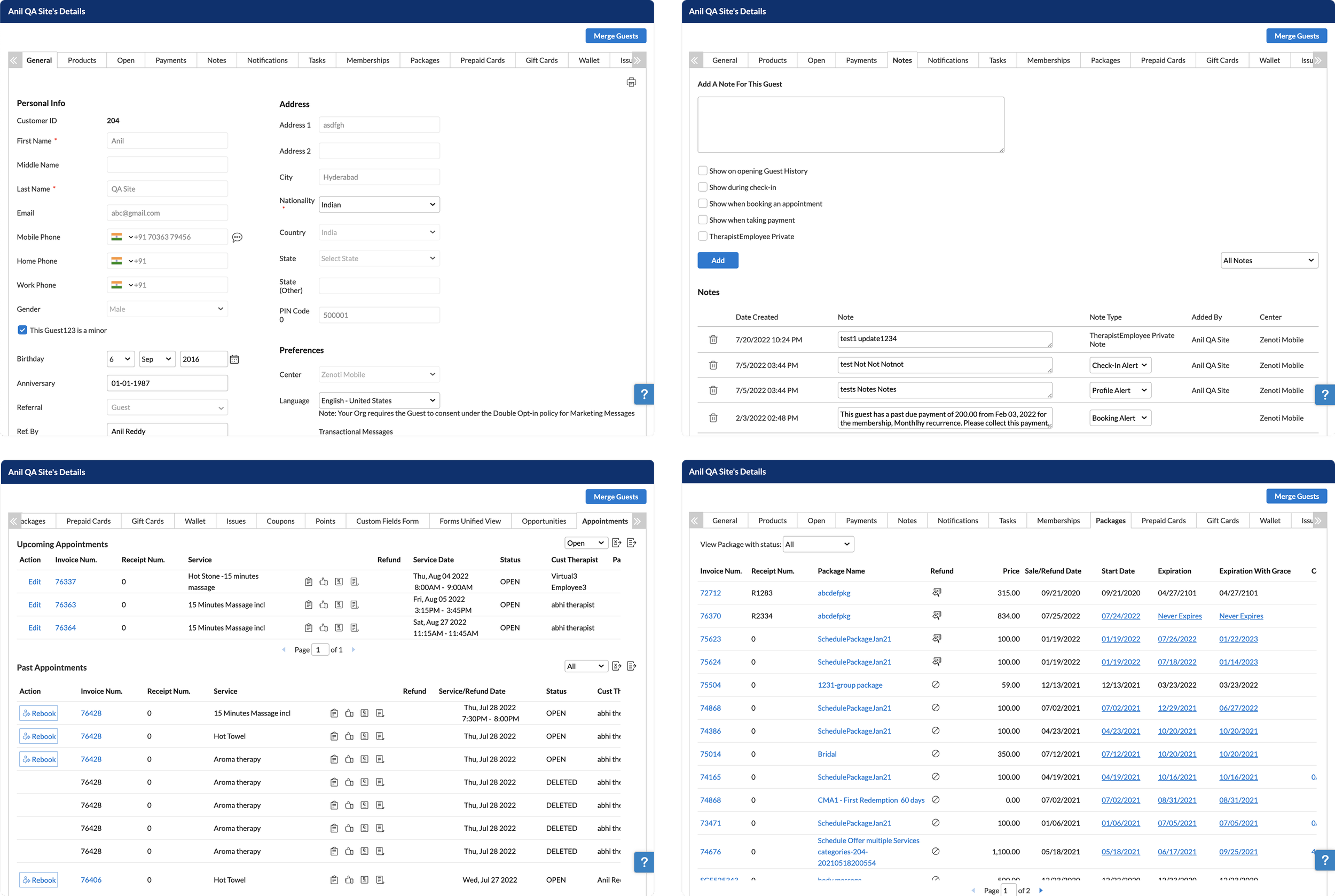
Our mission was clear: help staff quickly find the information they need without endless clicks and navigation—on any device. Beyond consuming information, certain workflows (like updating contact details or preferences) were cumbersome, and we aimed to make those seamless too. Each core section—appointments, memberships, packages, gift cards, payment records—was owned by different product managers and teams. Our first step was to meet with them to identify the most valuable information and actions in each area. A key insight emerged through these discussions: not all information needs to be front and center. We could layer the experience, surfacing the most critical details upfront while keeping deeper information easily accessible when needed.
We also noticed that the Front desk staff interact with guest profiles at multiple points—during booking, check-in, payment, and beyond. With this in mind, we built an overlay that can surface guest information anytime without interrupting their workflow.
For more in-depth interaction, we introduced expanded overlays that reveal additional details and actions. A robust design system ensured consistency across sections while allowing enough flexibility to highlight essential information where needed.
We also tackled the cluttered tab structure head-on. Instead of exposing 20+ tabs at the same level, businesses can now pin up to seven essential tabs, with rarely used options neatly tucked under a 'More' menu. This streamlined approach makes navigation simpler and faster.
By focusing on clarity and efficiency, we've transformed a cluttered, frustrating experience into a sleek, intuitive tool that empowers staff to deliver better guest service—faster and with fewer clicks. The redesigned guest profile has delivered outstanding results:
63% reduction in the need to navigate to other tabs, thanks to the new Overview section.
Tabs moved to the overflow menu account for just 3% of total usage, validating our hypothesis that most information does not need to be visible at all times.
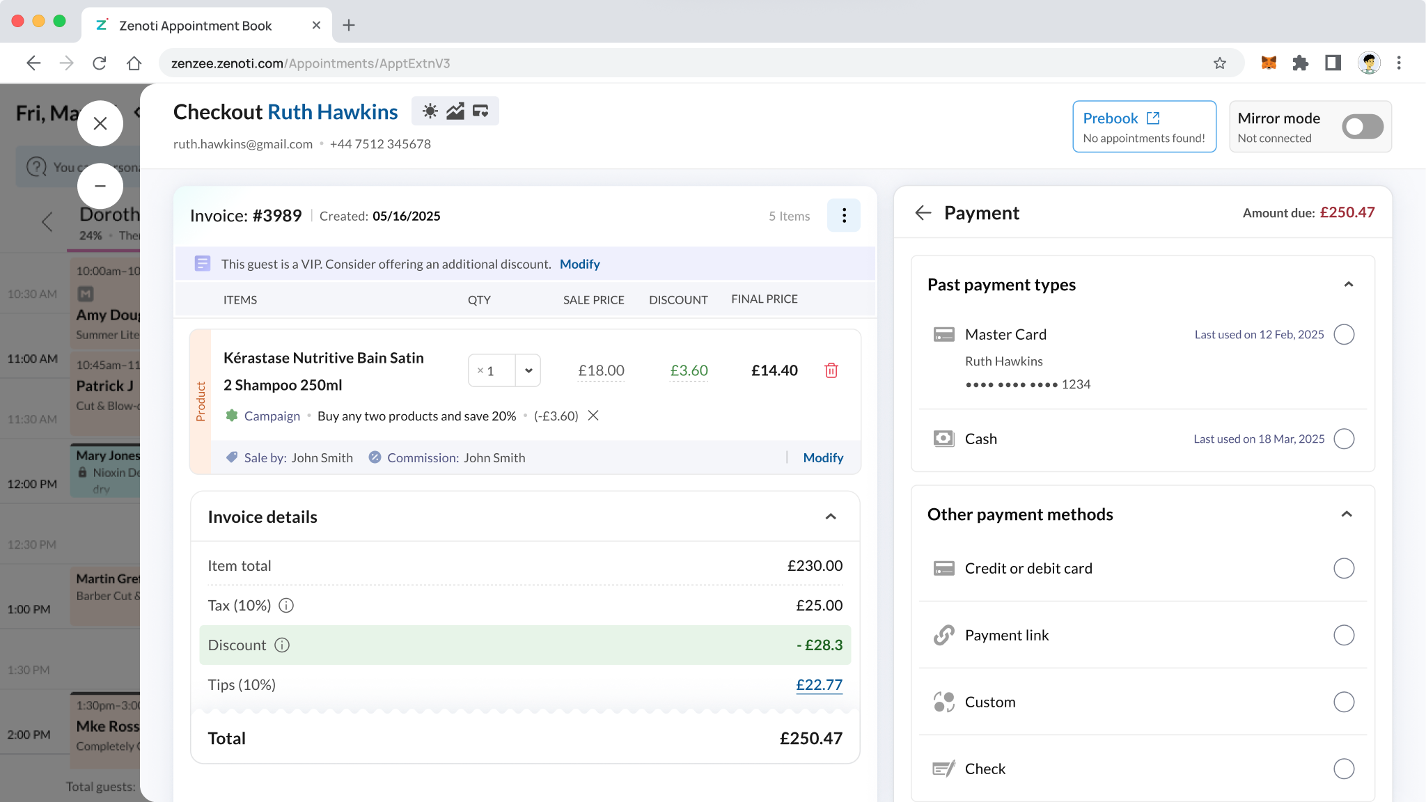
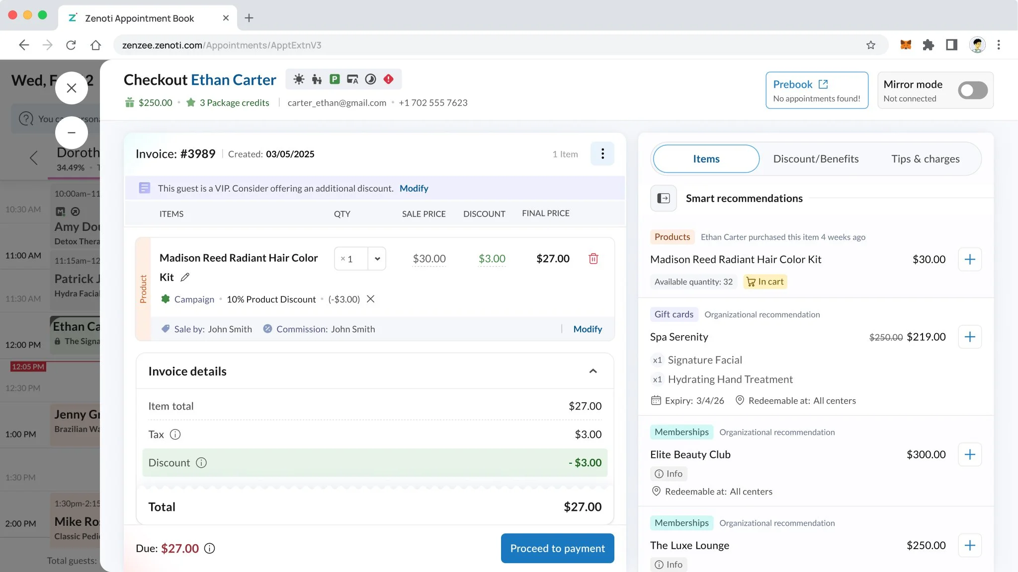
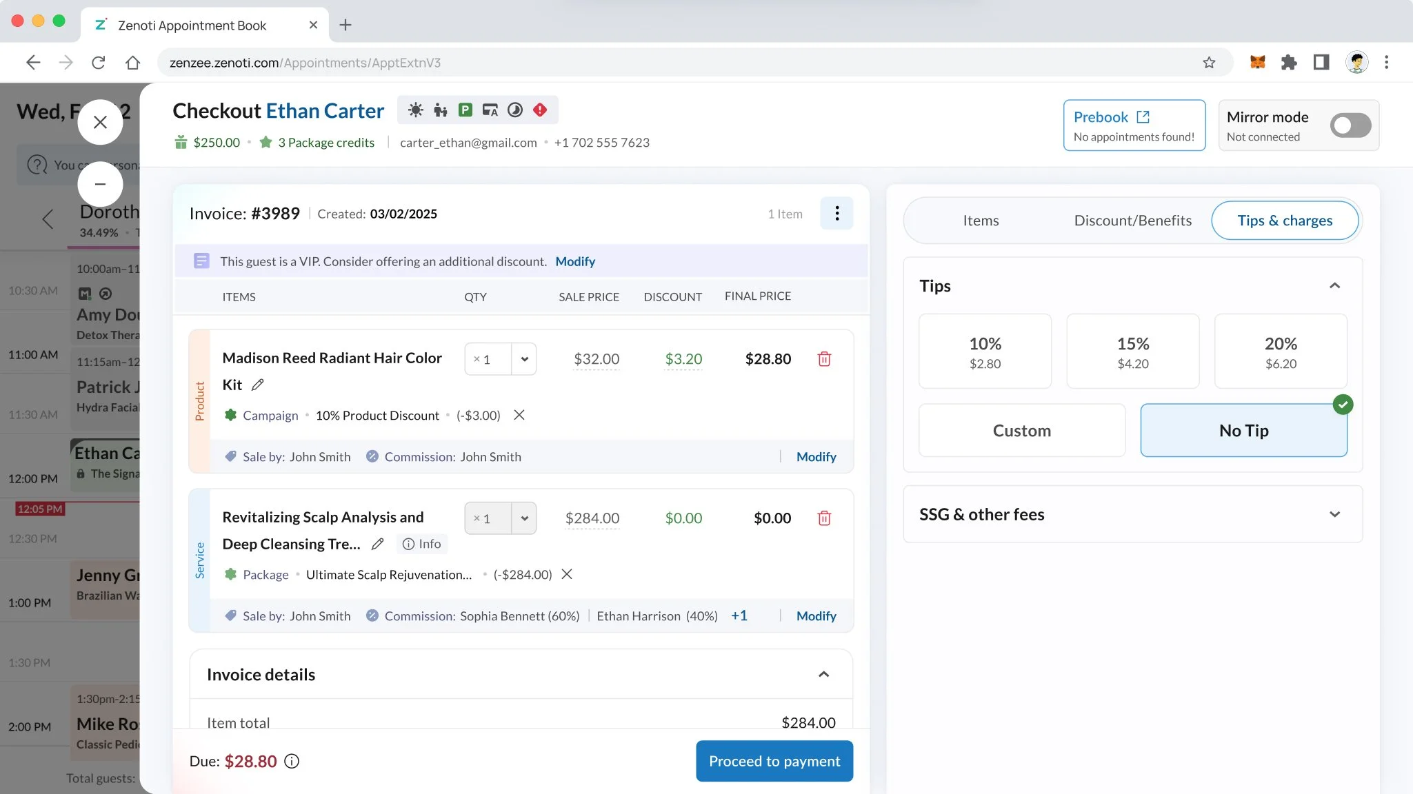
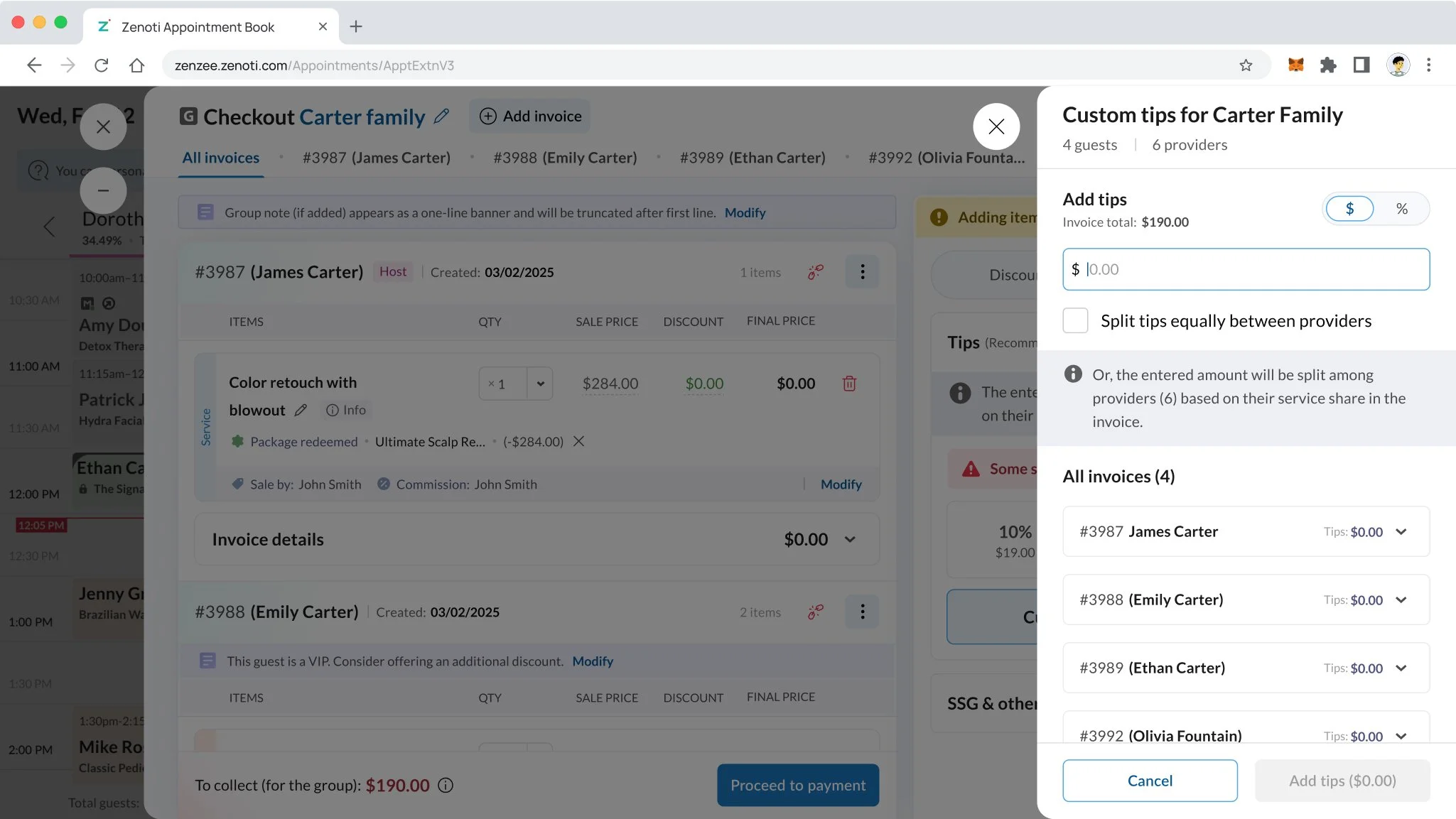
Point of Sale: How we transformed a frustrating POS into a fast, friendly, and fluid experience
The Point of Sale (POS) system hadn’t been redesigned in over a decade. While long-time users had adapted to its quirks, new staff found it confusing, inefficient, and overwhelming.
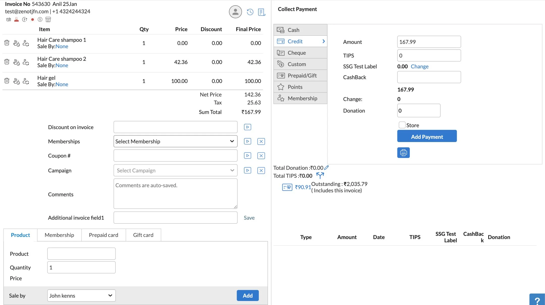
We began by benchmarking POS systems across industries—salons, restaurants, retail—and found no consistent best practices. So we started from first principles. By observing real-world workflows, we found one common pattern: everything happened in a simple, linear flow—review invoice, offer upsells, apply discounts or commissions, accept tips, and collect payment. We rebuilt the UI to mirror this mental model—progressive, guided, and clutter-free.
First up, the invoice had to be the heart of the UI—everything clearly presented and editable, from prices and discounts to sales attribution and commission splits.
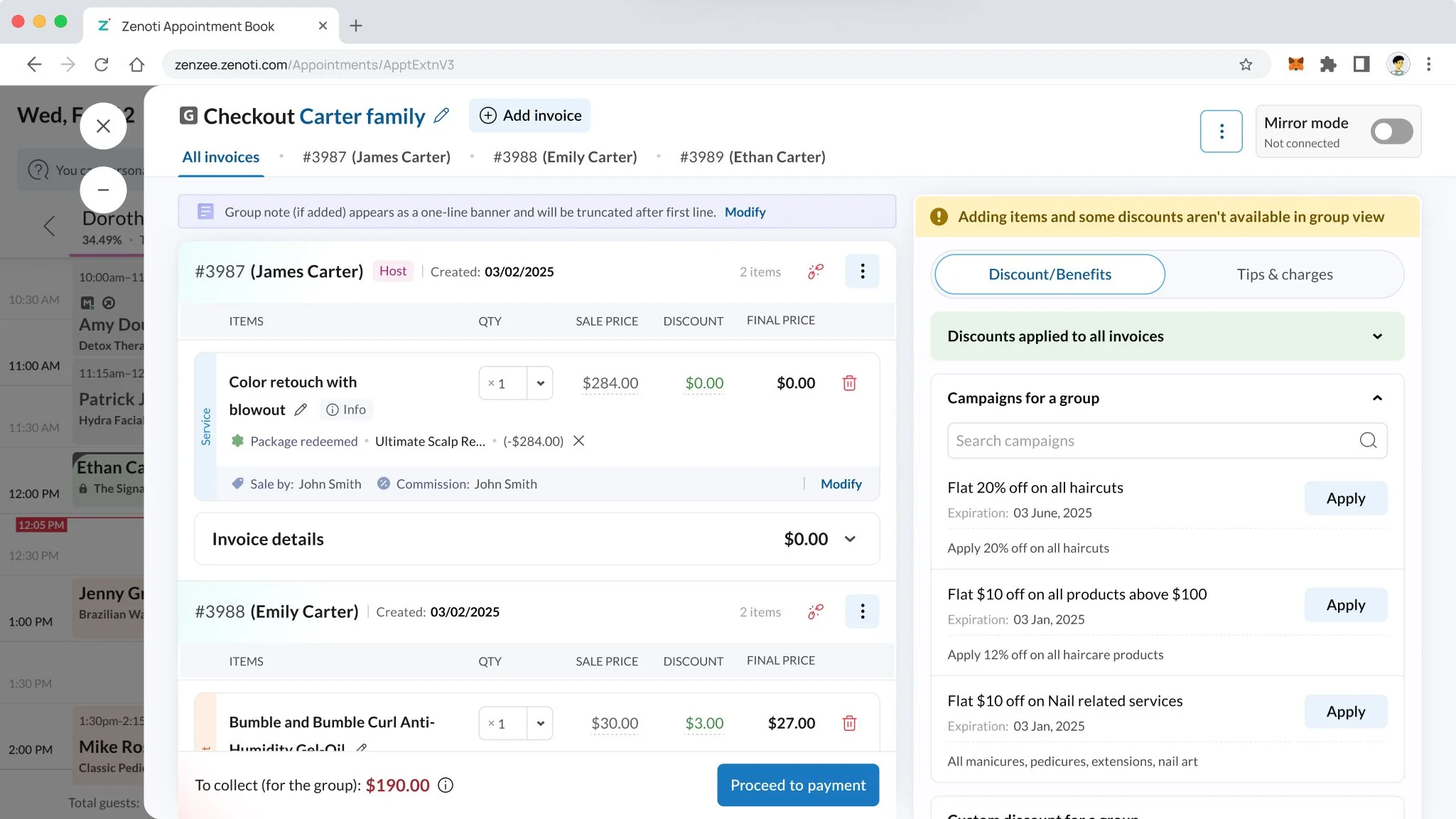
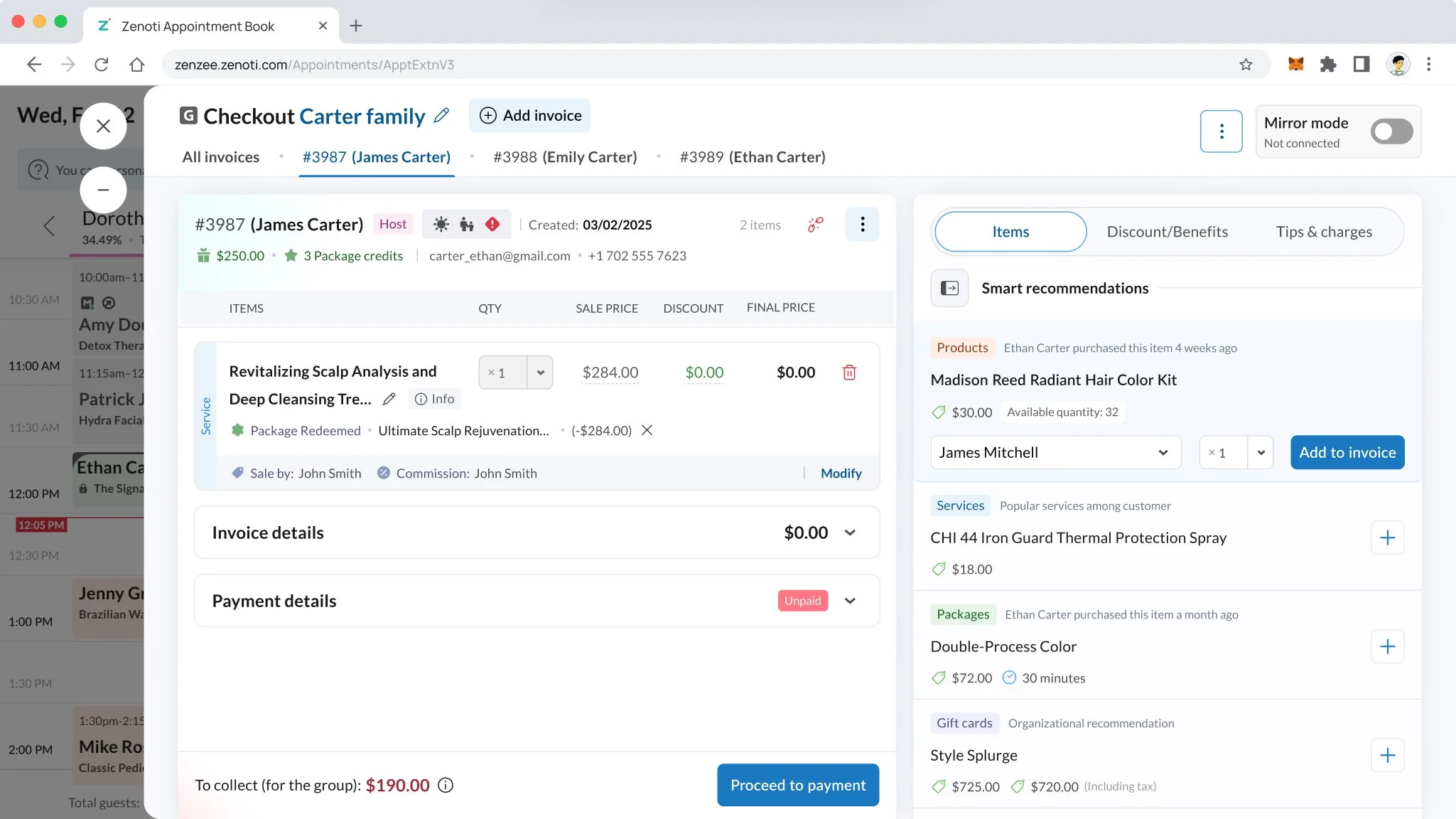
Upsells were a missed opportunity. Managers were frustrated by low retail and gift card sales. Staff, on the other hand, found it awkward to pitch products, especially without context. So we created a smart, contextual upsell engine—suggesting relevant items based on the service performed (e.g. shampoo after a color treatment) or surfacing previous purchases the guest might be running low on. The goal wasn’t to push—it was to help staff delight guests with timely, thoughtful suggestions.
Tipping got an upgrade too. For most guests, tipping should be one-tap and done—so we made it that simple. But for group appointments with multiple stylists, we enabled nuanced splitting—guests can tip everyone equally or customize amounts per stylist, without friction.
When it came to Payment, we uncovered two major issues. First, guests were often unaware they had gift cards or loyalty points, which frequently went unused and expired. Staff didn’t always remember to check either. We solved this by proactively surfacing any available balances right at checkout—clear, timely, and ready to apply with one tap.
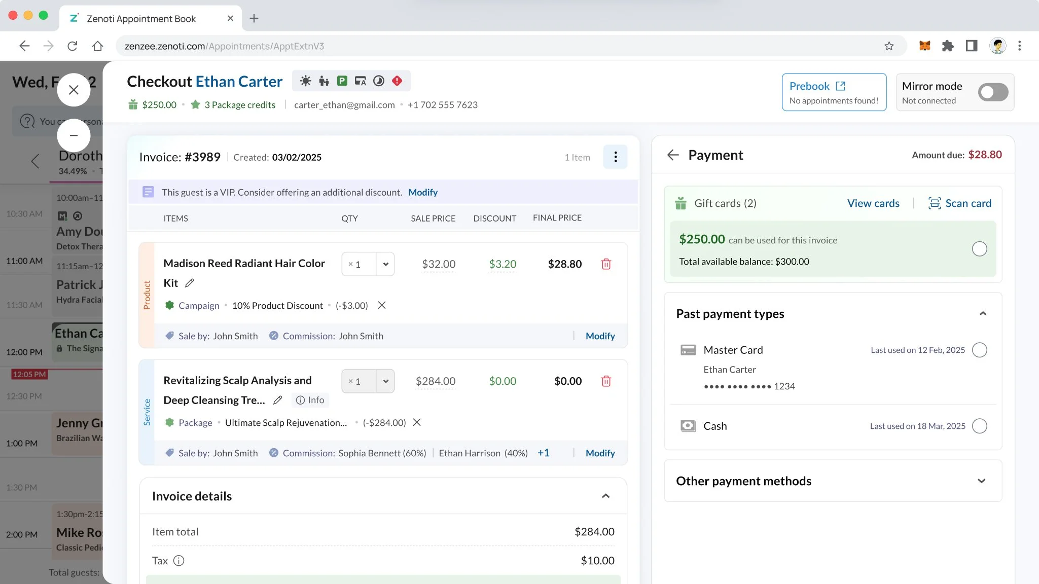
Second, we learned that guests tend to pay the same way each time—usually one or two preferred methods. So we redesigned the UI to bring those forward automatically, minimizing steps and reducing decision fatigue.
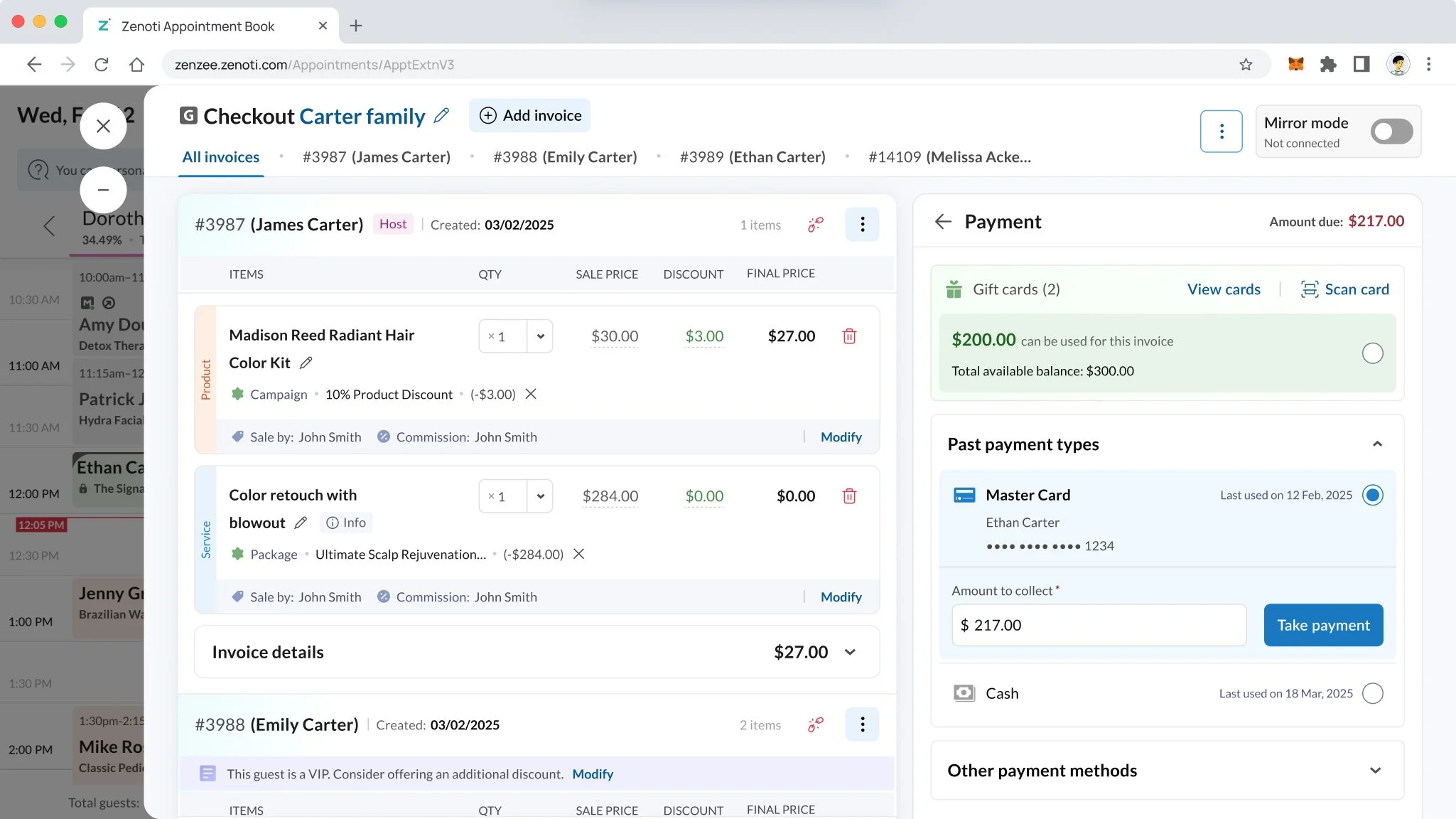
Last but not the least, Group visits! They were the real breakthrough. Previously, everything was bundled such a way that if three friends had three different stylists and wanted to pay separately. It created friction, confusion, and long waits at the counter. We redesigned the experience to treat each guest as a separate flow: staff can now toggle between group members, review and adjust each invoice individually, and check them out one by one—just like they would if the guests had walked in alone.
Within the first four weeks of our beta launch, the results were telling:
– Upsell conversions for retail and gift cards increased by 28%
– Gift card and loyalty redemptions went up by 34%, simply by making them visible at the right moment
– Group checkouts that previously took 5–6 minutes were now done in under 2
– And new staff members reported a 40% drop in training time for using the POS
This wasn’t just a redesign—it was a complete reimagination of what a checkout could feel like.
Booking Wizard: How we transformed front desk booking workflows to save time, clicks, and sanity
Our booking interface hadn’t been reimagined in over a decade. It operated through two separate modules—a compact calendar panel and a full-screen “booking wizard.” Each had exclusive capabilities, creating confusion for staff and forcing them to juggle between views. The bottom panel offered calendar visibility but lacked functionality. The wizard had the features—but opened in a separate window, breaking flow and drawing universal complaints.
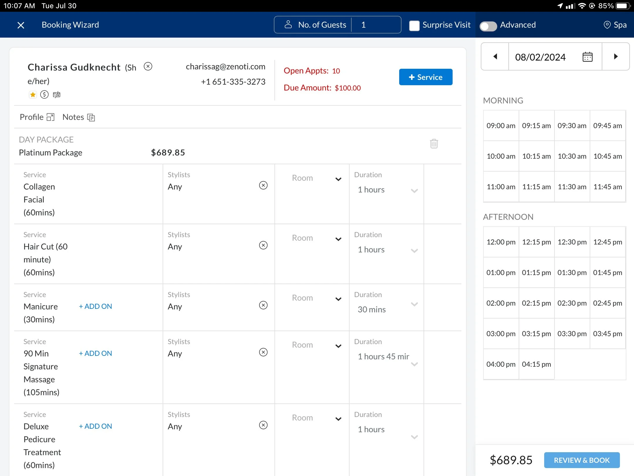
We decided to merge the best of both: a single, seamless UI where users can toggle between a compact panel and a full-screen experience as per their comfort and need—without losing any context.
Our research uncovered how wildly different booking workflows can be. Some guests just want to check availability before giving any details. Others—especially members—start by identifying themselves as they expect a personal touch! Some insist on their preferred stylist, while others care only about the first available slot. So we baked maximum flexibility into the system, without rigid starting points or locked flows.
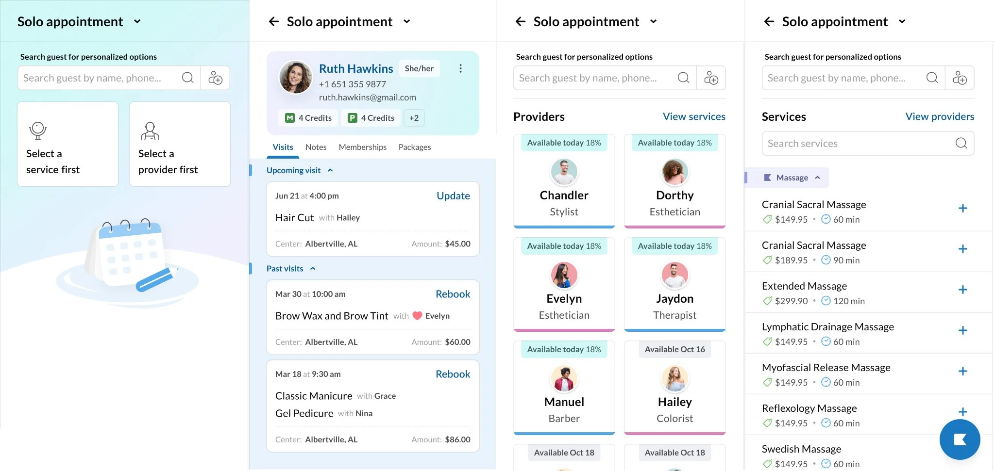
One of the biggest upgrades was personalization after a guest is selected. Their visit history, memberships, packages, and notes from past services are surfaced contextually—so front desk staff can rebook previous visits, redeem available credits, or suggest add-ons in seconds without jumping to another screen.
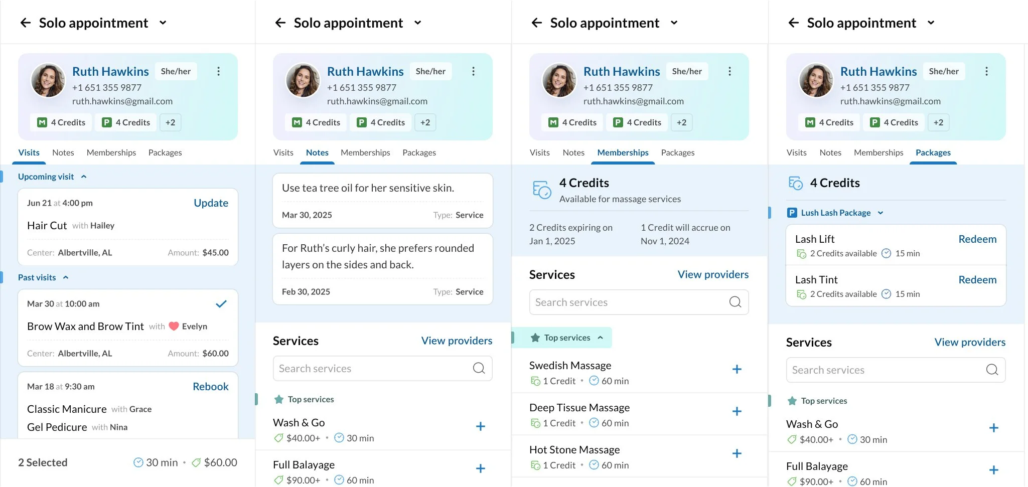
We also completely rethought how services are browsed. Gone are the clunky dropdowns and nested categories. In their place: a free-flowing, searchable catalog with floating menus that allow staff to quickly browse, find, and jump to the service they want—without interrupting the booking flow. It’s fast, forgiving, and optimized for both point-n-click and touch screen devices.
We layered in smart alerts to ensure operational hygiene—like nudging staff to collect missing emails or payment methods during the booking process.
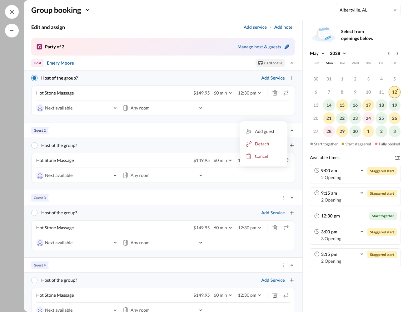
When it came to couples and group bookings, we tackled the complexity head-on. We enabled anonymous guests to be booked, allowed quick duplication of services across them, and even built a powerful visual scheduling panel that lets staff find slots where two or more guests can be serviced side-by-side—or in staggered order—without guesswork.
Within just a few weeks of beta launch, we saw dramatic improvements:
Single-service bookings were completed 35% faster
Membership or package-based bookings saw a 60% drop in errors or missed entitlements
Group bookings, which often took 3–5minutes, now took under 2 minutes on average
And overall, front desk teams reported higher confidence and fewer escalations
This wasn’t just a redesign. It was a rethink—of workflows, mental models, and what great front-desk software can feel like.